
Vous suivez désormais
Erreur de suivi de l'utilisateur.
Cet utilisateur n'utilise pas les utilisateurs à le suivre.
Vous suivez déjà cet utilisateur.
Votre plan d'adhésion ne permet que 0 suivis. Améliorez ici.
Ne suit désormais plus
Erreur lors de l'arrêt du suivi de l'utilisateur.
Vous avez désormais recommandé
Erreur lors de la recommendation de l'utilisateur.
Une erreur a eu lieu. Veuillez rafraîchir la page et réessayer.
E-mail désormais vérifié.

warszawa,
poland
Il est actuellement 7:28 PM ici
Rejoint le janvier 20, 2012
0
Recommandations
Piotr N.
@CreoIgnis
0,0
0,0
0%
0%
warszawa,
poland
N/A
Travaux complétés
N/A
Suivant le budget
N/A
Dans les temps
N/A
Taux de réembauche
Your needs - my imagination
Contactez Piotr N. concernant votre travail
Connectez-vous pour discuter de tous les détails via la messagerie.
Portfolio
Portfolio


Paris Look - hairdresser website
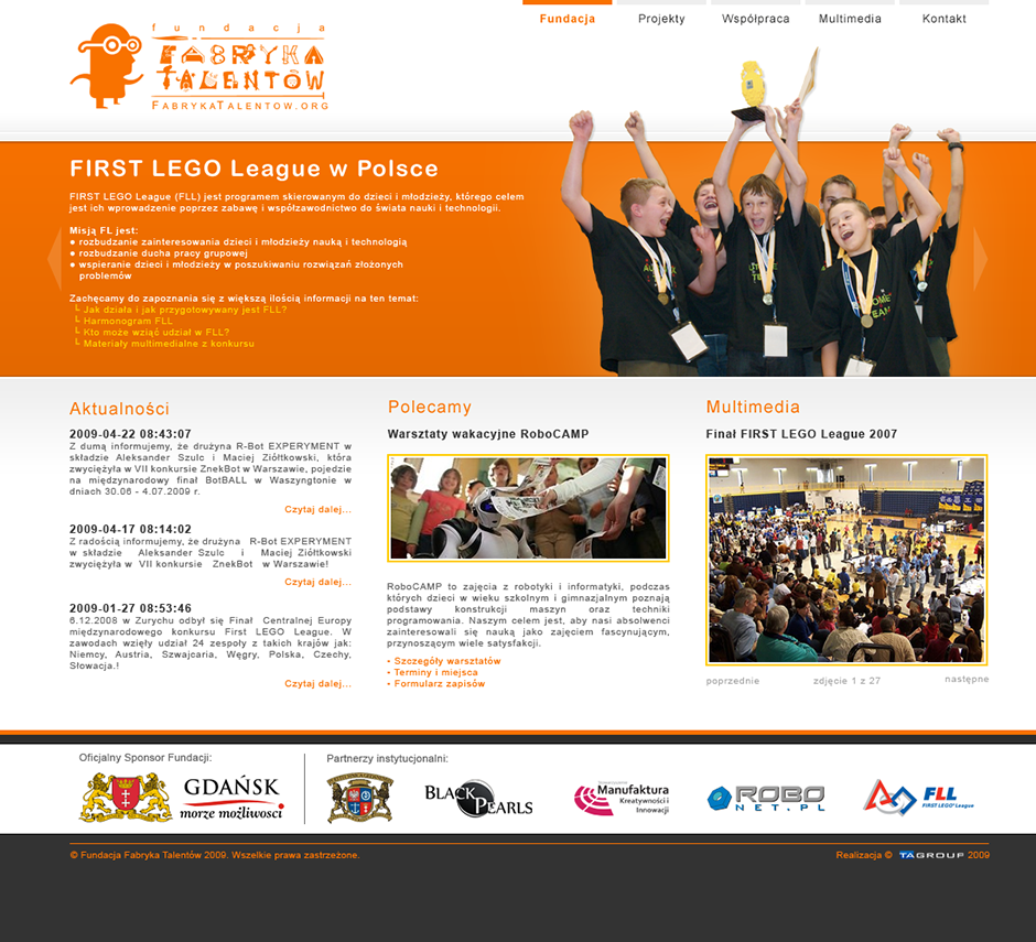

Fundacja Fabryka Talentow - foundation website
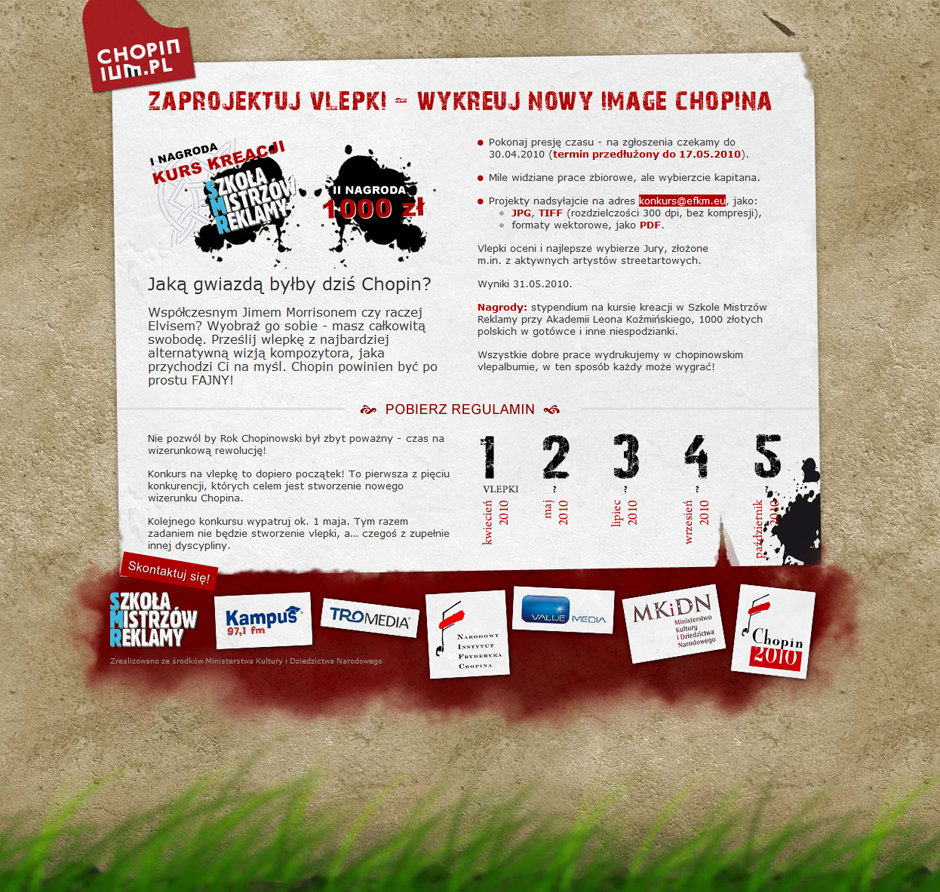

Chopinium - project website
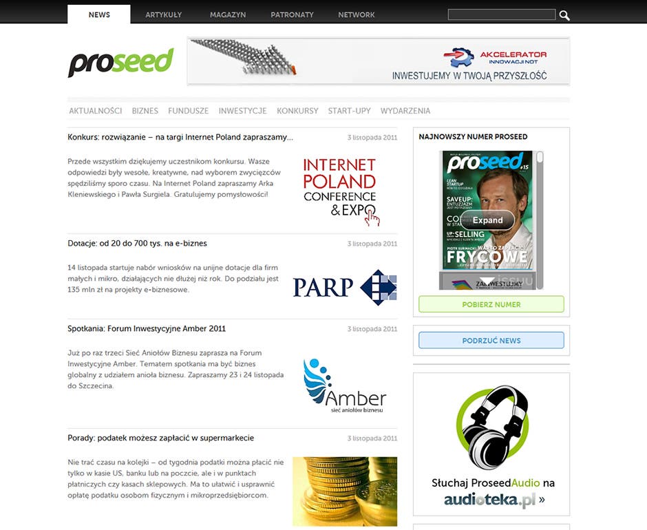

Proseed Online - start-ups and technology information portal
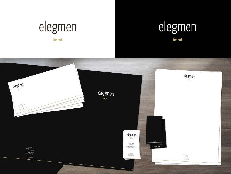

ELEGMEN - corporate identity
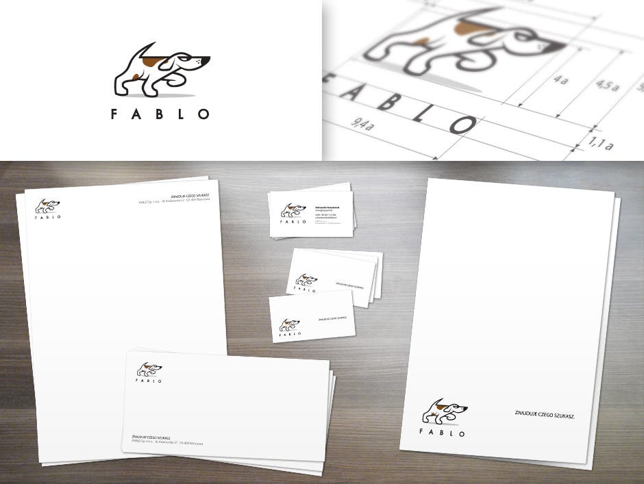

Fablo - corporate identity
Paris Look - hairdresser website
Fundacja Fabryka Talentow - foundation website
Chopinium - project website
Proseed Online - start-ups and technology information portal
ELEGMEN - corporate identity
Fablo - corporate identity
Commentaires
Modifications enregistrées
Aucun commentaire visible ici !
Expérience
DTP & Design One-Man Army
févr. 2011 - juil. 2011 (5 mois, 1 jour)
Spent over a year (started while formaly being a KINGS employee) learning about DTP, photo retouch, print design and, as a one-man design army, successfully publishing fourteen monthly issues.
As job became a routine, realized that I need something more to develop and challange myself.
Resigned, founded Creo Ignis. Started being happy.
Designer & Team Lead
mai 2010 - févr. 2011 (9 mois, 1 jour)
Became a design team leader thanks to what I've learned at TA Group over year ago. Learnt a lot about the value of communication strategies when it comes to design. Fought with own perfectionism and failed miserably. Soon, refocused on single but biggest KINGS' project - Proseed. And moved on.
Designer
oct. 2009 - mai 2010 (7 mois, 1 jour)
Big come-back to design. Lots of new things to learn and develop my skills. Discovered self-potential in learning new skills on-demand. Big hit in the head after realizing that there are other ways to develop a company than that corporate-typical style. Ubumind was reinvented into KINGS - with almost all its crew.
Éducation
Bachelor of Science degree in Engineering (spec. IT/computer graphics)
(2 ans, 6 mois)
Contactez Piotr N. concernant votre travail
Connectez-vous pour discuter de tous les détails via la messagerie.
Vérifications
Certifications
Meilleures compétences
Parcourir les freelances similaires
Parcourir les présentations similaires
Invitation désormais envoyée !
Merci ! Nous vous avons envoyé un lien par e-mail afin de réclamer votre crédit gratuit.
Une erreur a eu lieu lors de l'envoi de votre e-mail. Veuillez réessayer.
Échec de copie dans le presse-papier, veuillez réessayer après avoir ajuster vos permissions.
Copié dans le presse-papier.
Chargement de l'aperçu
Permission donnée pour la géolocalisation.
Votre session de connexion a expiré et vous avez été déconnecté. Veuillez vous connecter à nouveau.