Simplify A logo for trade mark

  • État: Closed
  • Prix: $50
  • Propositions reçues: 12
  • Gagnant: gk1713

Résumé du concours

We want to award this in 1-2 days. So first entries will almost certainly be awarded over late entries.

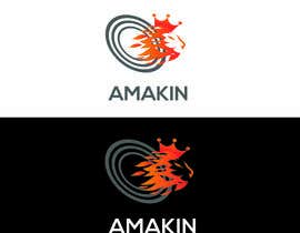
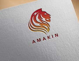
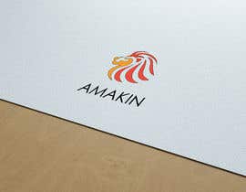
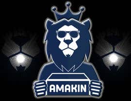
Our logo needs to be simplified. We like the idea of abstraction. I have supplied 2 images. One of our logo and one of an abstraction of our logo. This we love. See what you can come up with using the concept of the black and white image and our original image.

Maybe even enhance the black and white image.

Compétences recommandées

Commentaire de l'employeur

“A true professional. High level of creativity and quality second to none. Won our contest for logo design. Would highly recommend Gunjan. Would hire again.”

Image de profil kuatila, Australia.

Meilleures propositions de ce concours

Afficher plus de propositions

Tableau de clarification publique

  • kuatila
    Titulaire du concours
    • il y a 5 ans

    was just showing a friend how Freelancer works

    • il y a 5 ans
  • jecris
    jecris
    • il y a 5 ans

    kindly response.. thank you

    • il y a 5 ans
  • jecris
    jecris
    • il y a 5 ans

    Good Day Sir/Ma'am What do you mean? why you reconsidering my entry

    • il y a 5 ans
  • ededpalma
    ededpalma
    • il y a 5 ans

    have i a opportunity for post my entry?

    • il y a 5 ans
    1. kuatila
      Titulaire du concours
      • il y a 5 ans

      sorry Eduardo, we have already posted the winner. I have bought some of the second and third winners. maybe next time.

      • il y a 5 ans
  • kuatila
    Titulaire du concours
    • il y a 5 ans

    Thanks for the entries we will decide either Friday, being tomorrow or Early next week. Anyone of the entries not reject is still in the running. Thank you ll for the great work.

    • il y a 5 ans
  • MarcosDPaiva
    MarcosDPaiva
    • il y a 5 ans

    please check #122

    • il y a 5 ans
  • kuatila
    Titulaire du concours
    • il y a 5 ans

    Thank you for all the entries. This will be our product trademark. I have uploaded some more images that reflect our concept more clearly. particularly view lion8 for its bold character and lion9 jpg file for ideas on simplifying the lion down to just a few lines. In lion9 image we can see it is a lion but the artist has used so much constraint. This is the concept and design we are after.

    • il y a 5 ans
  • kuatila
    Titulaire du concours
    • il y a 5 ans

    We are trying to convey: Quietly strong, trustworthy, quality products for the Amakin Branded products

    • il y a 5 ans
  • kuatila
    Titulaire du concours
    • il y a 5 ans

    If possible remove the sunglasses on the lion, it looks unprofessional. The lion is a feature but really it is only about the essence of a lion or leopard or tiger.

    • il y a 5 ans
  • kabirpreanka
    kabirpreanka
    • il y a 5 ans

    Hi, please check my entries #30, #32 and #43

    • il y a 5 ans
  • adishri
    adishri
    • il y a 5 ans

    It would be great if the nature of the business is known. That would assist in choosing the right fonts and graphic styles.

    • il y a 5 ans
  • hashibmithu95bd
    hashibmithu95bd
    • il y a 5 ans

    Sir, Please check #41 & #42.Thank you

    • il y a 5 ans
  • kuatila
    Titulaire du concours
    • il y a 5 ans

    Thank you for the entries so far. Needs to be more like the Supplied black and white image. Just the essence of the lions face is all that is needed. Although the supplied image has a pattern / canvas applied. this is not necessary. Plain metallic look is the preferred look.

    • il y a 5 ans

Montrer plus de commentaires

Comment commencez des concours

  • Publiez votre concours

    Publiez votre concours Rapide et facile

  • Obtenez des tonnes de propositions

    Obtenez des tonnes de propositions De partout dans le monde

  • Attribuez la meilleure proposition

    Attribuez la meilleure proposition Télécharger les fichiers - Facile !

Publier un concours maintenant ou rejoignez-nous maintenant !