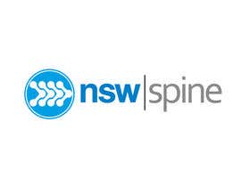
Logo Design for NSW Spine
- État: Closed
- Prix: $290
- Propositions reçues: 28
- Gagnant: darksyrup

Résumé du concours
Creative, professional, fresh and appealing logo design required!
Compétences recommandées
Commentaire de l'employeur
“@darksyrup won the contest on 6 December 2011”
![]() dusanobradovic, Australia.
dusanobradovic, Australia.
Tableau de clarification publique
-

realdreemz
- il y a 12 ans
please reply on PM by clicking on realdreem
- il y a 12 ans
-
realdreemz
- il y a 12 ans
*realdreemz
- il y a 12 ans
-

jw92189
- il y a 12 ans
@danumdata your #52 design is on this website. They are claiming its theirs. Just thought you should know.
http://www.logovilla.com/content/nsw-spine- il y a 12 ans
-

pandojevito
- il y a 12 ans
WTF??
- il y a 12 ans
-

creativeprogrmng
- il y a 12 ans
Sir, please consider all the good rules of a logotype, we worked a lot considering them, for instance, try to print in black and white the logo you likes (e.g.is it recognizable you have to fax it or to print in monochrome or grayscale)
Some helpful rules:
http://tannerchristensen.com/rules-for-logo-design/- il y a 12 ans
-

praxlab
- il y a 12 ans
#269 - a new approach to the product. Your feedbacks pls.
- il y a 12 ans
-
Titulaire du concours - il y a 12 ans
i like it a lot! something fresh! but i don't think management will sadly, it looks like a logo for a toy company. if you can rework it that would be appreciated. maybe have the 'spine' underneath the NSW on the right hand side and rework the design? thanks!
- il y a 12 ans
-
praxlab
- il y a 12 ans
HI the logo posted is strong and straight to the point. I can provide a blue version of it. This is surely not a toy company logo. I'd appreciate if you could visualise the logo on promotions and posters etc., It'd be surely a stand out fresh bold and unique one. Thanks.
- il y a 12 ans
-
Titulaire du concours - il y a 12 ans
Please get your final submissions in, we will not be extending the contest.
some great designs here so far, get them all in! thanks!- il y a 12 ans
-
realdreemz
- il y a 12 ans
#362 #363 #364 #365 #367
- il y a 12 ans
-
shahidco
- il y a 12 ans
Please check #339 #340 #342 #343
- il y a 12 ans
-

emilymwh
- il y a 12 ans
Please check #329
- il y a 12 ans
-

ShinymanStudio
- il y a 12 ans
http://www.gsk.com/ lol
- il y a 12 ans
-
Titulaire du concours - il y a 12 ans
hi everyone, less then 24hrs to go! please be creative and professional. no more designs/fonts that look like they have come from microsoft word! feel free to use differnet colours, blue, black, gray, red combos even!? Google NSW GOVERNMENT LOGO for a strong, modern looking logo idea. Would love to see something different, clean, crisp! we will be awarding the project to someone, so please submit your best designs. thank you everyone.
- il y a 12 ans
Voir 1 message de plus
-
realdreemz
- il y a 12 ans
- il y a 12 ans
-
Titulaire du concours - il y a 12 ans
#289 is your best one. interested in seeing what other colour combo you can come up with, and any other figure design if possible? thanks!
- il y a 12 ans
-

Brandable
- il y a 12 ans
Kindly View: #249
- il y a 12 ans
-
Titulaire du concours - il y a 12 ans
don't mind the font, however, the shield not so much!
- il y a 12 ans
-

golden432
- il y a 12 ans
dear sir, on #198, what changes do you need?
- il y a 12 ans
-
Titulaire du concours - il y a 12 ans
font needs to be changed please. not as many layers of dots around the circle please. thanks!
- il y a 12 ans
-

uthapa
- il y a 12 ans
#229 . Here is a little break from all those spinal cords.
- il y a 12 ans
-
Titulaire du concours - il y a 12 ans
haha thank you!
- il y a 12 ans
-

ulogo
- il y a 12 ans
#255 #254
- il y a 12 ans
-
emilymwh
- il y a 12 ans
Please check #223 . Thank!
- il y a 12 ans
-

tricmatt
- il y a 12 ans
Please check #194. Thanking you.
- il y a 12 ans
-
tricmatt
- il y a 12 ans
My mistake. It is now #195
- il y a 12 ans
-

CrystalCrown365
- il y a 12 ans
Could you check #175? Thanks!
- il y a 12 ans
-
CrystalCrown365
- il y a 12 ans
#174 I meant, sorry!
- il y a 12 ans
-
Delinquente
- il y a 12 ans
Please check #173 Thanks
- il y a 12 ans
-

Arts360
- il y a 12 ans
#172.
- il y a 12 ans
-
pandojevito
- il y a 12 ans
come on #168 not cool!!..... mine #149
- il y a 12 ans
-
Arts360
- il y a 12 ans
Please feedback on # 122 and 123
- il y a 12 ans
-
ShinymanStudio
- il y a 12 ans
Fortune 500 companies like to keep it simple, hardly any of them have people in the logos. Smith and Nephew does not. Many chiropractors have these exact same people and figures in their logos, the brand might be lost on the populations collective consciousness.
Just a thought, if you provide a world class product... have a solid sales network, a simple logo will do the world of good. You are not a graphics company, you sell high end biologics, which help people.
For some people, the ability to stand up or walk a few meters is a miracle in itself.- il y a 12 ans
-
creativeprogrmng
- il y a 12 ans
Fortune 500 companies born before the web2.0 era.
Anyway what a professional suggestion! Do you read the brief? He is a reseller. An Agent! No need to "collective consciousness" their clients are medic and nursery chiefs not the patient mass!
Medtronic and big company that produces have to like at the patient mass. An agent had to look affidable, clean, and modern (high tech) to the medical stuff (head physicians, etc etc).
Have you ever been at a surgical congress? They loves modern graphics and 3d animations in the presentations to explain complex new techniques.
Last but not least, athletic images like discus trhowers are historically been associated to health and medicine in many logos and campagin (a little bit of optimism my firend!)- il y a 12 ans
-
ShinymanStudio
- il y a 12 ans
"Draw reference from other big medical companies such as DePuy, Stryker, Smith & Nephew, Synthes etc. These can be googled easily. "
They obviously want to go places.
They at least have vision.
You got a nice design there man, but these people who buy the products are not super heros. They get a product which has a logo of super-man or a man in agony...
We are not bashing anyone, trying to walk in others shoes... how would you view some of these logos... would you not do research on a product before you put it inside of you!
We mean no malice, just our view point.
Keep on with the creative flow.- il y a 12 ans
-
Titulaire du concours - il y a 12 ans
Thank you everyone for ideas so far. Please be creative and think outside the box.
We only have two days left of competition and want to receive the best logo for our company.
Play around with word placement, maybe NSW on top, and spine on bottom?
Also abstract spines, modern crisp simple wording etc encouraged!
Be different, but professional. I've attached some ideas i came across. thanks!- il y a 12 ans
-
ShinymanStudio
- il y a 12 ans
Then why the over used figures! You supply to people who know about the products. Its a hard sell we know. But how many companies use the same figures over and over again.
We took the S from "S" and made it into the spinal cord, with key points. Are people wanting to remember a human figure with a spinal cord... that is a hard pill to swallow.
Your company supplies products which helps humanity. The majority of people will never live a normal life, many people after having back-operations have years of rehabilitation. A logo which shows agony or the ability to be a super hero does not fit well in our opinion.
Thanks for the direction, helps greatly. Will be submitting more original designs for the company.- il y a 12 ans
-
creativeprogrmng
- il y a 12 ans
Please kindly provide feedback for #65
- il y a 12 ans
-
creativeprogrmng
- il y a 12 ans
Sorry, #102 for tests #99 was a draft for my error.
Thank you.
Best regards,
Stefano- il y a 12 ans
-
creativeprogrmng
- il y a 12 ans
In addittion we posted some new simple, clean and creative proposals, give a glance please.
#112 #113 #114 #115.
Best regards,
Stefano.- il y a 12 ans
-
shahidco
- il y a 12 ans
#106 #107 #108 feedback plz
- il y a 12 ans
-

graphicsland
- il y a 12 ans
Please check #93 #94 #95 #96 #97 #98
- il y a 12 ans
-
Stevenlogos
- il y a 12 ans
PLZ FEEDBACK FOR 88 & 89
- il y a 12 ans
-

darksyrup
- il y a 12 ans
I've added a new designs & pls rate for #83 & #84 thanks..
- il y a 12 ans
-
jw92189
- il y a 12 ans
I would love to get your feedback on #61. Thanks!
- il y a 12 ans
-
Titulaire du concours - il y a 12 ans
need something with a more 'big company feel' sorry.
- il y a 12 ans
-

Habitus
- il y a 12 ans
Please check and feedback #62 #63, thanks!
- il y a 12 ans
-
Titulaire du concours - il y a 12 ans
don't like the font or the spine model sorry, good idea tho.
- il y a 12 ans
-
graphicsland
- il y a 12 ans
Please check #73 #74 #75 #76
- il y a 12 ans
-
Titulaire du concours - il y a 12 ans
i like the idea of the dots for the spine, but the figure is not quite what we're after.
- il y a 12 ans
Comment commencez des concours
-

Publiez votre concours Rapide et facile
-

Obtenez des tonnes de propositions De partout dans le monde
-

Attribuez la meilleure proposition Télécharger les fichiers - Facile !