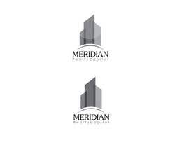
Logo Design for Meridian Realty Capital
- État: Closed
- Prix: $290
- Propositions reçues: 138
- Gagnant: didiwinata

Résumé du concours
This company is a real estate financing company based in LA. I would like to get a logo for the company. I do not have any color combinations in mind, however the website I am building is professional and clean looking. It will have a white background as
Compétences recommandées
Commentaire de l'employeur
“@didiwinata won the contest on 17 December 2012”
![]() klickit08, United States.
klickit08, United States.
Tableau de clarification publique
-

GDesignGe
- il y a 11 ans
,...
- il y a 11 ans
-

qoaldjsk
- il y a 11 ans
wew Congratz didiwinata.
- il y a 11 ans
-

didiwinata
- il y a 11 ans
Thanks qoaldjsk
- il y a 11 ans
-

nomi2009
- il y a 11 ans
please check #651
- il y a 11 ans
-

smartGFD
- il y a 11 ans
plz provide some feedback...............
- il y a 11 ans
-
Shrenik18
- il y a 11 ans
#636 please. Thanks :)
- il y a 11 ans
-
GDesignGe
- il y a 11 ans
:-)
- il y a 11 ans
-

creativegurus
- il y a 11 ans
Please rate #627 and #630 , thanks
- il y a 11 ans
-
creativegurus
- il y a 11 ans
Please rate #615 and see PM, thanks
- il y a 11 ans
-
nomi2009
- il y a 11 ans
check please #605
- il y a 11 ans
-

Logomaker1m1
- il y a 11 ans
Kindly check my entry
- il y a 11 ans
-
didiwinata
- il y a 11 ans
- il y a 11 ans
-

muzibul42
- il y a 11 ans
Please Check my logo #584,#583,#582,#581.... thanks!
- il y a 11 ans
-

CnYDesigns
- il y a 11 ans
Please have a look at #576, #577 and #578 and see your PM, thanks!
- il y a 11 ans
-

manthanpednekar
- il y a 11 ans
Plz Check #575
- il y a 11 ans
-
manthanpednekar
- il y a 11 ans
plz check #574
- il y a 11 ans
-

shrishashank
- il y a 11 ans
HI Kindly check #558, #570, #571, #572
- il y a 11 ans
-
creativegurus
- il y a 11 ans
Please rate #544 and read PM, thanks
- il y a 11 ans
-

nayrix101
- il y a 11 ans
Please check my entry #540.. ty!
- il y a 11 ans
-

Titulaire du concours - il y a 11 ans
ONLY ABOUT 24 HOURS LEFT IN THIS CONTEST. SOMEONE IS GUARANTEED TO WIN!
YOU CAN SEE OUR FAVORITES SO FAR. WE LIKE THE DESIGN BECAUSE IT IS CLEAN, MODERN, AND REPRESENTATIVE OF OUR COMPANY.
WE HOPE TO MORE IDEAS IN THE SIMILAR DIRECTION.
THAT DOES NOT MEAN TO COPY THAT DESIGN. WE ARE LOOKING FOR SIMILAR FEELS, BUT WITH YOUR OWN CREATIVITY. WE HAVE MANY PEOPLE LOOKING OVER ALL ENTRIES AND CAN RECOGNIZE COPIES. ANY DESIGNS WE BELIEVE ARE COPIES OF EARLIER ENTRIES WILL BE REJECTED.
THANK YOU AND GOOD LUCK!!- il y a 11 ans
-

logomaster055
- il y a 11 ans
thanks.
- il y a 11 ans
-

subdurmiente
- il y a 11 ans
Please check #533 and #534 . Thanks!
- il y a 11 ans
-
arteq04
- il y a 11 ans
#519 #520 THANKS!
- il y a 11 ans
-

nikster08
- il y a 11 ans
Please check #516 . Thank You.
- il y a 11 ans
-

ddlidd
- il y a 11 ans
Please check 504. Thanks!
- il y a 11 ans
-

logoraz
- il y a 11 ans
check #500, #501
- il y a 11 ans
-
Shrenik18
- il y a 11 ans
#499 please. Thanks :)
- il y a 11 ans
-
didiwinata
- il y a 11 ans
- il y a 11 ans
-
yadesh
- il y a 11 ans
Feedback on #485
- il y a 11 ans
-

wanskii
- il y a 11 ans
All my 8 entries got rejected, LOL.
- il y a 11 ans
-
nomi2009
- il y a 11 ans
please sir check the logo #453
- il y a 11 ans
-
nomi2009
- il y a 11 ans
please sir check the logo #452
- il y a 11 ans
-

whizzdesign
- il y a 11 ans
Please rate #440.
- il y a 11 ans
-
logoraz
- il y a 11 ans
check #439
- il y a 11 ans
-

LAgraphicdesign
- il y a 11 ans
Hello Sir. Please check my entries #434, #435, #436 , #437 . Thank you.
Best Regards
LA- il y a 11 ans
-

Rorico
- il y a 11 ans
Hello! Look at #424, please.
- il y a 11 ans
-
didiwinata
- il y a 11 ans
please check #371 #373
- il y a 11 ans
-
didiwinata
- il y a 11 ans
and #382 #395
- il y a 11 ans
-
mariadesigns78
- il y a 11 ans
Hi, please check Private Message (click on my username "mariadesigns78"). Thanks.
- il y a 11 ans
-
Titulaire du concours - il y a 11 ans
HELLO ALL DESIGNERS. THANK YOU FOR YOUR CREATIVE SUBMISSIONS. I WOULD LIKE TO EDIT OUR REQUESTS FOR FUTURE DESIGNS TO CONCENTRATE ONLY ON AN ICON IMAGE FIRST. FROM WHAT WE HAVE SEEN, WE THINK THAT TOO MANY DESIGNERS ARE PUTTING TOO MUCH EMPHESIS ON THE FONTS AND NOT ENOUGH ATTENTION TO THE IMAGE.
WE WILL BE MAKING OUR DECISION BASED ON THE ICON. WE HOPE TO SEE MORE OF YOUR CREATIVITY AND MOST IMPORTANTLY MORE ENERGY PUT TOWARD THE IMAGE.
THANK YOU!!!- il y a 11 ans
-

saif99
- il y a 11 ans
Dear CH, Please have a look at #366,#367. Thanks!
- il y a 11 ans
-

sixersgroup
- il y a 11 ans
Hello CH, Please Check #359, #360, #361, #362. Thnks...
- il y a 11 ans
-

rascian
- il y a 11 ans
Please check #358. Thank you.
- il y a 11 ans
-

diu40
- il y a 11 ans
my new one is #347
- il y a 11 ans
-
logoraz
- il y a 11 ans
please check #345
- il y a 11 ans
-
sixersgroup
- il y a 11 ans
Hello CH, Please Check #338. Thnks...
- il y a 11 ans
-
Titulaire du concours - il y a 11 ans
LAST MESSAGE CONTINUED....
LOGOS:
WE WANT TO SEE YOUR CREATIVITY. HOWEVER, PLEASE SEE ALL OUR FAVORITES SO FAR. THEY ALL HAVE CLEAN LINES, NOT TOO OVERLY ABSTRACT BUT CREATIVE INTERPRETATION OF THE USE OF THE M OR BUILDINGS. IT IS AN OBVIOUS CHOICE TO USE BUILDINGS, BUT WE HOPE TO SEE CREATIVE INTERPRETATIONS FOR THEM THAT CAN STAND ALONE FOR USE WITHOUT THE TYPE AS WELL. WE REALLY WOULD LIKE THE LOGO TO HAVE BRANDING POWER AND LOOK NICE WHEN IN BLACK/WHITE PRINT AS WELL- il y a 11 ans
-
Titulaire du concours - il y a 11 ans
LAST MESSAGE CONTINUED...
COLORS:
AS YOU CAN SEE THAT OUR HIGHEST RATED DESIGNS THUS FAR HAVE A WIDE VARIETY OF COLORS. HOWEVER THEY ALL USE A NEUTRAL SHADE OF THE PALETTE. THE COLORS STAND OUT, BUT ARE NOT TOO "AGGRESSIVE". THAT IS IMPORTANT TO US.
I HOPE THIS HELPS GIVE EVERYONE THAT WANTS TO SUBMIT NEW ENTRIES A BETTER IDEA OF OUR DIRECTION. AND IF YOU HAVE ANY DOUBT, JUST LOOK AT ALL THE DESIGNS THAT WE HAVE RATED THE BEST SO FAR AND TRY TO INTERPRET WHAT THEY ALL HAVE IN COMMON, BUT USE YOUR CREATIVITY TO STAND OUT!!!!
THANK YOU ALL AND GOOD LUCK!- il y a 11 ans
-
Titulaire du concours - il y a 11 ans
HELLO ALL. WONDERFUL SUBMISSIONS. WE HAVE SEEN SO MANY CREATIVE IDEAS. HOWEVER, FOR ALL PREVIOUS AND NEW ARTISTS.....PLEASE SEE THE HIGHEST RATED DESIGNS SO FAR. EVEN THOUGH THEY ALL LOOK DIFFERENT, WE LIKE THOSE DESIGNS THE BEST SO FAR BECAUSE THEY ALL SEEM TO HAVE SOME THINGS IN COMMON. FUTURE ENTRIES THAT CAN BE ALONG THIS DIRECTION WILL HAVE A BETTER CHANCE TO WIN THIS CONTEST.
HERE IS WHAT OUR FAVORITE DESIGNS HAVE IN COMMON (IF YOU HAVE NOT NOTICED YET):
FOR FONTS -
1) "THIN' LETTERS ARE BETTER THAN "THICK" ONES - WE FEEL THESE TYPES OF FONT REFLECT A CLEAN AND CONTEMPORARY LOOK WE ARE GOING FOR- il y a 11 ans
-

Nikusaini
- il y a 11 ans
Please check #301 #302 #303 thanks..............
- il y a 11 ans
Comment commencez des concours
-

Publiez votre concours Rapide et facile
-

Obtenez des tonnes de propositions De partout dans le monde
-

Attribuez la meilleure proposition Télécharger les fichiers - Facile !