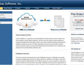
Illustration to be shown front and center on Choices Software, Inc. website
- État: Closed
- Prix: $290
- Propositions reçues: 9
- Gagnant: jasminkamitrovic

Résumé du concours
Specialize in forms software for the insurance industry.
Compétences recommandées
Tableau de clarification publique
-

GrafixSmith
- il y a 12 ans
Hi CH, any thought for #94 & # 95 ? Thanks.
To me, simple and friendly graphics will do the best. For the button, I make it more neat and clean and user will get the message in a single glance. Any comment is welcome. Thanks : )- il y a 12 ans
-

mintsauce
- il y a 12 ans
Hi, i posted a mockup, #79.
Both image references that you attached are at 96 DPI and the screen resolution is 72 DPI. All submited mockups are bigger than they will appear implemented on your website.- il y a 12 ans
-
mintsauce
- il y a 12 ans
thanks. feedback ?!
- il y a 12 ans
-

emdes19
- il y a 12 ans
#71
- il y a 12 ans
-
designerdevilz
- il y a 12 ans
Hi, Can you please review and provide some feedback on #65
- il y a 12 ans
-

Titulaire du concours - il y a 12 ans
Please see private message. Thank you.
- il y a 12 ans
-
Titulaire du concours - il y a 12 ans
On second thought, our suggestion to remove all the text above the button on the right is not such a great idea. Users do need to know that we are offering a free trial so they can try filling in the ACORD Forms, not just trying the Smartcloud. Or maybe all the text can be removed above that button and the text within the button could be improved. All ideas are welcome.
- il y a 12 ans
-

monselj1
- il y a 12 ans
#42 Have a nice day!
- il y a 12 ans
-
Titulaire du concours - il y a 12 ans
Maybe the blue color could be closer to the blue color on the rest of the site. All of the text above the button on the right can be removed entirely. Also the "Click Here" text on the button can be removed completely, which might make it easier to work with. We are looking for a consistent look and feel across our home page. The less cluttered the better. After seeing the cloud image we would like the viewer's eye to be drawn to the "Try it Free!" button, without have to many other things competing for their attention. Less is more.
- il y a 12 ans
-
monselj1
- il y a 12 ans
Noted! I hope you like the new one #49 have a nice day!!
- il y a 12 ans
-
Titulaire du concours - il y a 12 ans
If we go with a colored background we would probably need to have a separate layer for the background because our website always defaults to screenwidth. In other words, we would likely need a sliced image of the background that can be repeated horizontally as needed to fill the available space. Please be awadre that we are database centric software developers; not experts in html.
- il y a 12 ans
-

creomindesignz
- il y a 12 ans
Noted with thanks!
Stay tuned!
CMD- il y a 12 ans
-
Titulaire du concours - il y a 12 ans
Your efforts are very much appreciated. We know it can be frustrating to try to figure out what someone else is looking for.
- il y a 12 ans
-
Titulaire du concours - il y a 12 ans
A sentence has been added under the "View Brief" button above mentioning that if anyone wants to include a new button to replace the one on the right side of our web page that currently has red text, that would be a plus. It would make sense for the two graphics to be complimentary to each other. This request is optional.
- il y a 12 ans
-

AvoDsign
- il y a 12 ans
Hello, please feedback my designs #20 and #21, give me your opinion. Thanks
- il y a 12 ans
-
AvoDsign
- il y a 12 ans
Simple, clean and a fresh touch. Have a nice day!
- il y a 12 ans
-
creomindesignz
- il y a 12 ans
Hi Contest Holder! Pls rate and give your valuable feedback (privately) on design #11 and #12.
Stay tuned, more designs coming in :)
CMD- il y a 12 ans
-

raffyph1
- il y a 12 ans
Please kindly see #2. thanks
- il y a 12 ans
-
designerdevilz
- il y a 12 ans
Dude, that is ACORD not ACCORD. Think you may want to correct the spelling!
- il y a 12 ans
-
raffyph1
- il y a 12 ans
Nobody's perfect dude, thanks anyways.
- il y a 12 ans
-
Titulaire du concours - il y a 12 ans
So far we like #1 the best because it is very clean and simple. Also, the white background eliminates the need for a repeating image (for different screen resolutions).
- il y a 12 ans
-
Titulaire du concours - il y a 12 ans
Nice first submission. Thank you.
- il y a 12 ans
Comment commencez des concours
-

Publiez votre concours Rapide et facile
-

Obtenez des tonnes de propositions De partout dans le monde
-

Attribuez la meilleure proposition Télécharger les fichiers - Facile !