Freelancer : GrayLotus
Partager :
Signaler la proposition

Entry 2

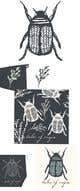
Hello! I wanted to draw more botanical’s but unfortunately I ran out of time and just tossed everything together. I tried a few more color ideas and added in the text as you asked. Let me know if you have any other ideas!

Proposition n°17 du concours                                                 Illustrate Something
Proposition n°17

Tableau de clarification publique

  • michalhicks
    Titulaire du concours
    • il y a 6 ans

    Nice. Maybe some more spacing between elements. One last thing to try is to use the other more premium fonts 'Prata' and 'Montserat' against it to see if it makes it more premium.

    • il y a 6 ans
    1. GrayLotus
      GrayLotus
      • il y a 6 ans

      ‘Prada’ and ‘Montserrat’ :
      https://imgur.com/BpvWtMx

      A few fonts that I think matched :
      https://imgur.com/wShpw4l

      Personally, I like ‘Prada’.
      I’d be happy to try more if you found any others.

      How many elements and patterns will you need? I plan to make more color combinations but I dont want to overwhelm you with too many options.

      • il y a 6 ans
    2. GrayLotus
      GrayLotus
      • il y a 5 ans

      Hello! I haven’t heard from you in a while. I just want to let you know I’m more than happy to re-do the project in a different style.

      • il y a 5 ans