
sanahossain10
Bangladesh

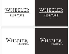
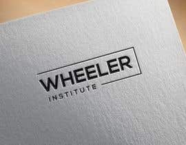
The Wheeler Institute is a new company that will be helping international schools with child protection training. We need a logo done first, and eventually will need some corporate materials designed (business cards and letterhead primarily). We are leaning against having an image or illustration be part of the logo - probably just the name (Wheeler Institute) - but we're open to considering other options. The logo needs to work well both horizontally and vertically and so shouldn't be too long or too tall.
The contest is only for the logo. If we select your logo, we will want to talk about corporate materials as a separate job, but that work may go to someone else. Also, while we will accept the image file types listed for the contest we will want a vector format (AI, EPS, PDF, SVG or other common vector format) of the logo that will scale properly.
Concepts to consider regarding logo design:
- We're not inclined toward a logomark using graphics. That doesn't mean we couldn't be convinced to use a graphic of some kind, but keep in mind including a graphic may make us reject your design
- The logo needs to convey seriousness and responsibility - think Harvard or Oxford not McDonalds.
- Some initially submitted designs incorporated a wheel. While a clever idea, this won't work for us.
- Please don't use clip art.
- Be creative!
- Don't just give us other versions of logos that are still under consideration - some logos may be there for reasons unrelated to how much we like them. Don't read too much into the ratings.
- Because we really are primarily considering designs primarily with text, your font choice is going to be really important. Choose something unusual, but professional and with a serious image (not Comic Sans or Jokerman)
=========PLEASE READ==========
We have extended the deadline. The submissions we haven't rejected yet are fine. But we'd like more choices. Unfortunately, the most recent 500 logos or so have essentially all been copies of ones that were not rejected yet.
WE WILL BE REJECTING ANY NEWLY SUBMITTED LOGOS THAT APPEAR TO BE VARIATIONS ON ALREADY SUBMITTED ONES
You should try to be creative. We'd really like to see more suggestions for different font-only versions. These will get looked at. Also, please don't highlight the double e in whEEler, whether by removing parts of the e's or something else. These will not be considered either. And if you are going to do some sort of logo mark, make sure it does NOT include the i from institute.
“Did a nice design and got me the files I needed very quickly.”
![]() edsunder, United States.
edsunder, United States.


Publiez votre concours Rapide et facile

Obtenez des tonnes de propositions De partout dans le monde

Attribuez la meilleure proposition Télécharger les fichiers - Facile !