Design a Logo for online store

  • État: Closed
  • Prix: €30
  • Propositions reçues: 4
  • Gagnant: umarfaruk007

Résumé du concours

Design a logo for a Company called "Topelle" which is into e-commerce and online marketing. Logo spirit: Quality & Online Business.

The Logo should be on a transparent background as well as on white & Black backgrounds and in all the industry standard sizes (website, email signature, favicon...) and formats (adobe original logos, JPEG, PNG...).

The website is designed for a WOMAN audience ONLY.
For the text color : black color. Font: HelveticaNeue
We gonna keep the design simple.
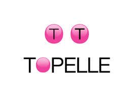
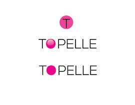
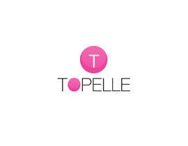
For the FAVICON: mak a circle (Pink color code : #ee429c) + a "T" inside in white color
NO text under "TOPELLE" please

--> We want to have also a view of : just keep the text : fill the "O" with pink color (#ee429c) like the logo of Boom by cindy joseph
--> https://www.boombycindyjoseph.com/

Logo criteria:

1) Should become a Brand. So guys please stay on something sober, friendly and simple yet attractive. Class/Business is most welcome.
3) The circle will be used in favicon

Different sizes expected : 170x170 : 170x51 ; 400x100 ;
Favicon : 32x32

Feel free to leave us a message if you find anything unclear.

Good luck !

Compétences recommandées

Commentaire de l'employeur

“excelletn i recommand”

Image de profil raphalmuller, France.

Meilleures propositions de ce concours

Afficher plus de propositions

Tableau de clarification publique

  • masidulhaq80
    masidulhaq80
    • il y a 6 ans

    #140

    • il y a 6 ans
  • jibon50
    jibon50
    • il y a 6 ans

    Please check entry #136 better look and a bit thicker font.

    • il y a 6 ans
  • umarfaruk007
    umarfaruk007
    • il y a 6 ans

    Entry #135 More discrete font. Hope you like it. However if further changes require just let me know. Thank you

    • il y a 6 ans
  • raphalmuller
    Titulaire du concours
    • il y a 6 ans

    #entry120 : very good, ust one thing :
    - a bit thicker font
    - the "O" will usefor the favicon as well: to put the same "O" + black "T" inside

    • il y a 6 ans
    1. Nipusoren12
      Nipusoren12
      • il y a 6 ans

      sir please cheek #130

      • il y a 6 ans
  • tarekrfahmy
    tarekrfahmy
    • il y a 6 ans

    Please can you give me feedback about my entries, thanks.

    • il y a 6 ans
    1. raphalmuller
      Titulaire du concours
      • il y a 6 ans

      I'll ask my business partner

      • il y a 6 ans
    2. tarekrfahmy
      tarekrfahmy
      • il y a 6 ans

      thanks

      • il y a 6 ans
  • umarfaruk007
    umarfaruk007
    • il y a 6 ans

    Please check entry #127 #131 In entry #131 better look and a bit thicker font

    • il y a 6 ans
  • tarekrfahmy
    tarekrfahmy
    • il y a 6 ans

    dear, please review my entry #129

    • il y a 6 ans
  • tarekrfahmy
    tarekrfahmy
    • il y a 6 ans

    dear, please review my entry #125

    • il y a 6 ans
  • raphalmuller
    Titulaire du concours
    • il y a 6 ans

    Alright . we're almost there !
    #entry 114: we'd like please : the font-family is good, we just want it a bit more thick or bold
    the favicon circle HAS TO BE THE SAME as the "O" ---> and "T" inside in black please

    • il y a 6 ans
  • raphalmuller
    Titulaire du concours
    • il y a 6 ans

    #entry101 : good job mate for the "O" !
    just the problem is the font, we are looking for a more discreet font, classy and thin. Attractive for women
    You can make a few tests with different fonts
    For the favicon, same, the font has to be thinner, for example like #entry93

    • il y a 6 ans
    1. umarfaruk007
      umarfaruk007
      • il y a 6 ans

      Got it. thank you. Just give me some time. I'm working on it.

      • il y a 6 ans
    2. umarfaruk007
      umarfaruk007
      • il y a 6 ans

      Got it. thank you. Just give me some time. I'm working on it.

      • il y a 6 ans
  • alex00dev
    alex00dev
    • il y a 6 ans

    please check #105

    • il y a 6 ans
  • umarfaruk007
    umarfaruk007
    • il y a 6 ans

    Dear CH, please check entry #101. As your requirements. If any changes require just let me know. Thank you

    • il y a 6 ans
  • cminds49
    cminds49
    • il y a 6 ans

    Entry #95 please Check

    • il y a 6 ans
  • raphalmuller
    Titulaire du concours
    • il y a 6 ans

    You see the logo SEPHORA: this font

    https://www.sephora.com/

    • il y a 6 ans
    1. raphalmuller
      Titulaire du concours
      • il y a 6 ans

      it's HelveritcaNeue

      • il y a 6 ans
  • raphalmuller
    Titulaire du concours
    • il y a 6 ans

    #entry89: interesting circle with T for favicon (keep pink code : #ee429c for circle please)

    • il y a 6 ans
  • raphalmuller
    Titulaire du concours
    • il y a 6 ans

    #entry83: the pink circle is for the favicon, with white or black "T" inside (we ant to check both)
    The logo itself is in black

    And to see one with the "o" filled with pink as described

    • il y a 6 ans
  • raphalmuller
    Titulaire du concours
    • il y a 6 ans

    #entry31 : interesting entry!
    For the text color : black color. Font: HelveticaNeue
    Please REMOVE the circle on the left. We gonna keep the design simple.
    The circle will serve ONLY for the FAVICON: Pink color code : #ee429c + the "T" inside in white color
    NO text under "TOPELLE" please : --> remove "quality & online business"

    --> We want to have a view also of : remove the left circle, just keep the text : fill the "O" with pink color #ee429c like the logo of Boom by cindy joseph --> https://www.boombycindyjoseph.com/

    Good luck !

    • il y a 6 ans
  • raphalmuller
    Titulaire du concours
    • il y a 6 ans

    guys we appreciate your creativity and freedom.
    We look carefully all entries, we are open, but try to stick to the descritpion please and comment

    • il y a 6 ans
  • raphalmuller
    Titulaire du concours
    • il y a 6 ans

    #entry83 interesting! I'll ask my business partner

    • il y a 6 ans
  • raphalmuller
    Titulaire du concours
    • il y a 6 ans

    Just keep text only
    the circle will be used for FAVICON

    • il y a 6 ans
  • raphalmuller
    Titulaire du concours
    • il y a 6 ans

    #entry31 : interesting entry!
    For the text color : black color. Font: HelveticaNeue
    Please REMOVE the circle on the left. We gonna keep the design simple.
    The circle will serve ONLY for the FAVICON: Pink color code : #ee429c + the "T" inside in white color
    NO text under "TOPELLE" please : --> remove "quality & online business"

    --> We want to have a view also of : remove the left circle, just keep the text : fill the "O" with pink color #ee429c like the logo of Boom by cindy joseph --> https://www.boombycindyjoseph.com/

    Good luck !

    • il y a 6 ans
    1. mdmafi6105
      mdmafi6105
      • il y a 6 ans

      Entry #80

      • il y a 6 ans
  • vowelstech
    vowelstech
    • il y a 6 ans

    check my design #72

    • il y a 6 ans
  • vowelstech
    vowelstech
    • il y a 6 ans

    Start Working!

    • il y a 6 ans
  • cminds49
    cminds49
    • il y a 6 ans

    Al A. Entry #57 Entry #59

    • il y a 6 ans
  • deydesign
    deydesign
    • il y a 6 ans

    plz check my design #40

    • il y a 6 ans
  • masidulhaq80
    masidulhaq80
    • il y a 6 ans

    please check #37

    • il y a 6 ans
  • josepave72
    josepave72
    • il y a 6 ans

    The colors to use in the logo must be the same as the logo that you uploaded?

    • il y a 6 ans
    1. raphalmuller
      Titulaire du concours
      • il y a 6 ans

      there must be the same pink as i uploaded defintely

      • il y a 6 ans
  • Rifatkhan101
    Rifatkhan101
    • il y a 6 ans

    If you can inbox me.

    • il y a 6 ans
  • raphalmuller
    Titulaire du concours
    • il y a 6 ans

    #entry1 however i don't agree for the shopping bag on the left

    • il y a 6 ans
  • raphalmuller
    Titulaire du concours
    • il y a 6 ans

    hi guys ! Please keep hustling and ubmitting ! I 'm sure you can do better

    • il y a 6 ans
    1. Rifatkhan101
      Rifatkhan101
      • il y a 6 ans

      #4

      • il y a 6 ans
  • raphalmuller
    Titulaire du concours
    • il y a 6 ans

    #entry1 : it's good how you did the font & colors in 2 parts : TOPelle
    smart work

    • il y a 6 ans
  • rajchoudhary265
    rajchoudhary265
    • il y a 6 ans

    hiii ch i am interested in your project can are you there

    • il y a 6 ans
    1. raphalmuller
      Titulaire du concours
      • il y a 6 ans

      yes

      • il y a 6 ans

Montrer plus de commentaires

Comment commencez des concours

  • Publiez votre concours

    Publiez votre concours Rapide et facile

  • Obtenez des tonnes de propositions

    Obtenez des tonnes de propositions De partout dans le monde

  • Attribuez la meilleure proposition

    Attribuez la meilleure proposition Télécharger les fichiers - Facile !

Publier un concours maintenant ou rejoignez-nous maintenant !