Design a Logo for dog(horse)-equipment producer
- État: Closed
- Prix: $100
- Propositions reçues: 1
- Gagnant: vimoscosa

Résumé du concours
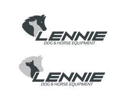
Please create a logo for a dog-equipment (leashes, collars, ...) producer:
- use the word "LENNIE" or "Lennie" as a brand
- stilized symbol or grafik of a pet/horse (head) possible, but not necessary
- you can use no animal or a dog, horse, dog AND horse, dog OR horse (preferable the same letters "LENNIE/Lennie" an than a grafik of the dog/horse to change with regards to the product line)
- do NOT use a paw only as a grafik/symbol, because the German company "Jack Wolfskin" is sueing lots of people and companies who are using paws in their logo (paws with a grafik inside should be ok.)
- easy to print and reproduce (should be possible to print in black/white)
- IN THE IDEAL CASE THE WHOLE LOGO (OR PARTS OF IT) IS SO SIMPLE, THAT I CAN USE IT TO PUNCH/STAMP IT ON LEATHER OR TO GRAVE IT ON METAL
The main properties of the products/company are: HAND MADE, high quality, very robust and durable, ecological, close to nature, used for dog sport and training.
At the moment we are only producing dog-equipment, but soon we will produce horse equipment too, so this two animals can be in the logo (but do not have to).
Potential customers wants to have more than the "normal" equipment and are willing to pay a higher price for it. But this higher price is paid for better funktionality and good quality, not only for the look, fashion, Strass.
Colours:
Even I do not prefere neon-colours for the logo, neon-orange is such a significant top-seller in our product range, that it could/should be in the logo.
Black is top seller too.
Darkbrown, Red, Blue are middle range sellers.
Wine red and Darkgreen are not sold that often, but I like this colours.
A combination of (maximum two!) colours is possible, as well it is possible to use different colours for the different product lines dog and horse.
I have attached pictures of the colours, I do not have a RGB-code, so just use the pics, that is close enough for the "right" colour. (I have uploaded each file double, one time with the technical name, one time with the real name, so don't look for the difference, but I can't delete the files)
Tagline:
Finally I prefere a tagline.
The content will change, e.g.: dog equipment, horse equipment, dog and horse, leather (products), or this words in German or possibly other languages.
For more question just email: hl-b@gmx.net
Compétences recommandées
Commentaire de l'employeur
“vimoscosa\'s logo won my contest to design a logo out of 511 different logos and options. Congratulation again. Communication was always perfect, he was fast and willing to help with all my questions. So I\'m happy with his job and will hire him again in the near future.”
![]() sebpublic, Germany.
sebpublic, Germany.
Tableau de clarification publique
-

logodesigingpk
- il y a 10 ans
Lets See Hope For the BeST :)
- il y a 10 ans
-

Titulaire du concours - il y a 10 ans
You logo is polarizing a lot. You love it or you don't. But at the end it is up to me, and for me it is to playful for this purpose, sorry. But for lots of my friends yours was the best.
- il y a 10 ans
-
logodesigingpk
- il y a 10 ans
I will be take care for the next time and Congratulation on You new logo :) Also to Congratxx to vimoscosa :)
- il y a 10 ans
-

kk58
- il y a 10 ans
Really a nice contest is this, thank you very much dear CH.
- il y a 10 ans
-
Titulaire du concours - il y a 10 ans
Please check ur private messages. :-)
- il y a 10 ans
-
kk58
- il y a 10 ans
OK, I checked, YOU ARE GREAT, thanks a lot.
- il y a 10 ans
-
Titulaire du concours - il y a 10 ans
THANK YOU ALL AGAIN FOR THIS NICE CONTEST!
THE WINNER IS vimoscosa! CONGRATULATION!
Sorry, that lot's of my requirements came only up during the contest. But now I know what I want. :-)
If you have any questions just let me know. I enjoyed working with you a lot and qill use Freelancer again, for sure.- il y a 10 ans
-

LionWikki
- il y a 10 ans
Thanks Sir i also enjoyed working with you hope we work again together :)
- il y a 10 ans
-
LionWikki
- il y a 10 ans
congratulation vimoscosa :-)
- il y a 10 ans
-
kk58
- il y a 10 ans
vimoscosa, I congratulate you in advance.
- il y a 10 ans
-
LionWikki
- il y a 10 ans
Best of luck to All :)
- il y a 10 ans
-

NikhilChirde
- il y a 10 ans
Kindly have a look at #493 and #494 . I hope you like it. Thank you.
- il y a 10 ans
-
NikhilChirde
- il y a 10 ans
Also #498 .. Color variation, used Wine Red.
- il y a 10 ans
-

tabatemohcine
- il y a 10 ans
please check #492
- il y a 10 ans
-
LionWikki
- il y a 10 ans
check #483 & give feedback thanks
- il y a 10 ans
-
LionWikki
- il y a 10 ans
#489 also
- il y a 10 ans
-

sansdesign2012
- il y a 10 ans
Please cheak and think about it.. Thank you... #479
- il y a 10 ans
-
Titulaire du concours - il y a 10 ans
good work! but doesn't meet my expectation for this specific logo I'm looking for.
- il y a 10 ans
-
Titulaire du concours - il y a 10 ans
to many details in the logo :-)
- il y a 10 ans
-

jinupeter
- il y a 10 ans
Please check #474 #475 thank you
- il y a 10 ans
-
Titulaire du concours - il y a 10 ans
Good idea, but to playful for my purpose.
- il y a 10 ans
-

Pedro1973
- il y a 10 ans
LOL the big and great expertsolution is a fake
- il y a 10 ans
-
Titulaire du concours - il y a 10 ans
I only ask myself and my friends and collegues, so I don't care how many Like's someone gets here and how many experts support one idea.
And I have looked on the "original", what is a "copy" from antik age as well.- il y a 10 ans
-
Pedro1973
- il y a 10 ans
ok, just conect the dots from original..to make another original without the dots :)
- il y a 10 ans
-
sansdesign2012
- il y a 10 ans
Please check my new entry #471
Thank you- il y a 10 ans
-
Titulaire du concours - il y a 10 ans
done.
too filigree to me. too many details.- il y a 10 ans
-
Titulaire du concours - il y a 10 ans
****************************************************************************************************
Thx again for all the entries and variants.
I've asked friends and colleagues to help me to choose the best logo. "Unfortunately" they have all a different favorite, so it is again up to me to make a decision. :-)
I think I'll use my time up to the official end of the contest to pick the winner.
You can still offer new ideas, even it will be hard now to have a real chance to win, since I have the impression, that all possible ideas were already shown by somebody.
*****************************************************************************************************- il y a 10 ans
-

abd786vw
- il y a 10 ans
HAVE A LOOK AT #465
- il y a 10 ans
-
Titulaire du concours - il y a 10 ans
too playful
- il y a 10 ans
-
sansdesign2012
- il y a 10 ans
please check my new logo and give me a feedback on it ( thank you.) #454
- il y a 10 ans
Voir 4 messages supplémentaires
-
LionWikki
- il y a 10 ans
Best Of Luck Man :)
may be Contest holder still not check this link http://cdnpix.com/show/imgs/192a78dd8c85b003de6755f0b785177e.jpg- il y a 10 ans
-
Titulaire du concours - il y a 10 ans
Can't see it any more, but I guess it was a joke related to the discussion about IMExpert...
Yes, I have looked on the "original" in the internet, what is based on a pictures from the antik age...- il y a 10 ans
-

hemanth2851990
- il y a 10 ans
#458 & #459
- il y a 10 ans
-
Titulaire du concours - il y a 10 ans
rejected, sorry. too much, doens't fit into the requirements.
- il y a 10 ans
-

jhaypalileo
- il y a 10 ans
#437 IS COPY FROM INTERNET http://cdnpix.com/show/imgs/192a78dd8c85b003de6755f0b785177e.jpg
- il y a 10 ans
-
LionWikki
- il y a 10 ans
yap hope for the best :)
- il y a 10 ans
-
Titulaire du concours - il y a 10 ans
Believe me, I noticed this "support" already and will take it into my consideration.
- il y a 10 ans
-
kk58
- il y a 10 ans
Is there any winner announced please..................................
- il y a 10 ans
-
Titulaire du concours - il y a 10 ans
Not yet. :-)
I have my favorites, but "unfortuantely" friends I ask right now to tell me their favorites choose different ones. :-) So I still have to think. Decision will NOT be done before the end of the contest in 19 hours.- il y a 10 ans
-

DowerDesign2013
- il y a 10 ans
#437 is perfect design and professional color theme
- il y a 10 ans
-
DowerDesign2013
- il y a 10 ans
That is rejected entry Mat ... :)
- il y a 10 ans
-
Titulaire du concours - il y a 10 ans
I'm not an Artist, and even I liked a lot few of the art-entries, for this purpose (strong, durable equipment) it is too much for me. :-)
- il y a 10 ans
-
sansdesign2012
- il y a 10 ans
i know ( lionwikke).... lol... ummmmmmmma... just wait and watch....
- il y a 10 ans
-
sansdesign2012
- il y a 10 ans
i know ( lionwikke).... lol... ummmmmmmma... just wait and watch....
- il y a 10 ans
-

imdatafreelancer
- il y a 10 ans
#437 best
- il y a 10 ans
-
sansdesign2012
- il y a 10 ans
Please check my new entry #445
- il y a 10 ans
-
Titulaire du concours - il y a 10 ans
#445 the letters are even more filigran than in #170, too playful for me
- il y a 10 ans
-

IMExpertSolution
- il y a 10 ans
Please Check #437 #436 #435 #434 #433 #432
Thank you- il y a 10 ans
-
Titulaire du concours - il y a 10 ans
Done. I changed my favourite to #437.
- il y a 10 ans
-
IMExpertSolution
- il y a 10 ans
Thank you so much sebpublic
any changing in this design so tell me i will change?- il y a 10 ans
Comment commencez des concours
-

Publiez votre concours Rapide et facile
-

Obtenez des tonnes de propositions De partout dans le monde
-

Attribuez la meilleure proposition Télécharger les fichiers - Facile !