Tableau de clarification publique

  • conrad4784
    Titulaire du concours
    • il y a 10 ans

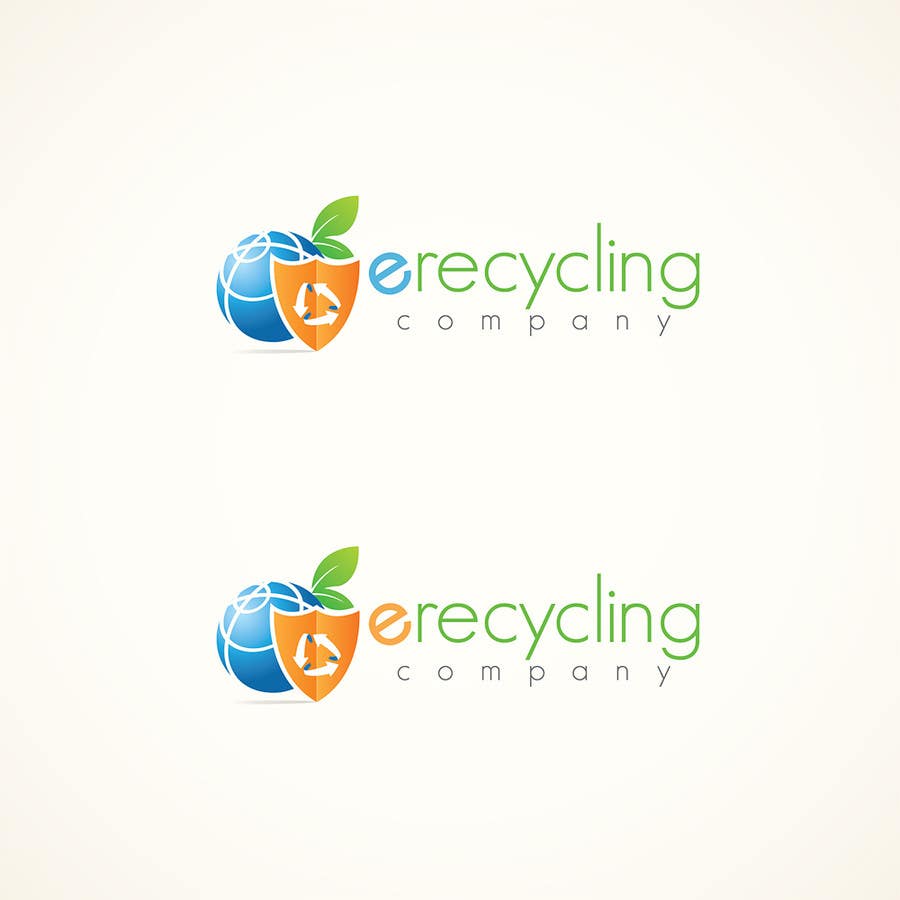
    on the top logo could you make the recycle symbol all blue, the earth if possible could have continents on it, maybe put a little space between the "e" and recycle and put a dot or small shield to separate the two whatever looks better and left align the word "company" at the bottom. thank you

    • il y a 10 ans