Design a logo for a blog/business about retirement planning
- État: Closed
- Prix: $125
- Propositions reçues: 53
- Gagnant: eddesignswork

Résumé du concours
Hi Freelancers,
We are starting a brand new website themed around retirement planning for people approaching retirement age without enough savings. It is not a financial planning site. It will encompass all aspects of retirement including lifestyle, emotional needs, living arrangements and travel as well as budgeting.
This will be a blog website, primarily, although we will also be creating and selling products.
We are looking for a talented, ambitious and creative designer with a great eye for creating stunning logos.
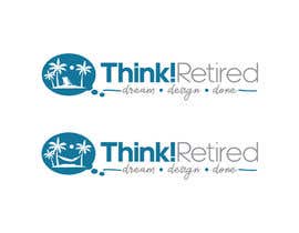
The logo should contain the words "Think! Retired".
I'd like "Think! Retired" to be on one line and then below it would be the words “Dream Design Done” placed in an attractive manner
To the left hand side of the whole design, I would like an icon that could be used as the logo in certain situations. This requires that it be unique, attractive and memorable.
The whole thing must fit together perfectly to look like one single fluid creation, not various elements dumped together on the screen.
I'd like to the logo to be with designed with rich, upscale colors indicating class and respectability
Since the site is NOT a financial planning site, design elements purely focused on money will not be appropriate for this brand.
The winning designer will get more work from us, in the form of social media graphics, etc - so it is well worth entering.
I will attach a file that contains a rough idea of what I have in mind, but that is just one concept. Please feel free to submit any attractive design you have in mind that fits the theme of the site.
I will want the design furnished both as a transparent png and as a layered file, either psd or xcf.
Thank you.
Compétences recommandées
Commentaire de l'employeur
“Excellent design work. Fully amenable to change requests. Personable and professional. Will work with again.”
![]() DannyLeigh, United States.
DannyLeigh, United States.
Tableau de clarification publique

Comment commencez des concours
-

Publiez votre concours Rapide et facile
-

Obtenez des tonnes de propositions De partout dans le monde
-

Attribuez la meilleure proposition Télécharger les fichiers - Facile !