Design a Logo
- État: Closed
- Prix: $40
- Propositions reçues: 30
- Gagnant: SVV4852

Résumé du concours
Hi everyone!
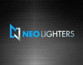
I'm looking for a logo for my lighter company, "Neo Lighters". It is a new company that is planning to sell plasma/arc lighters that are 100% electric without the use of gas or liquids to operate. Please feel free to google pictures or videos of the lighter to gather some inspiration.
The logo should have a symbol or icon that is going to represent the brand. It shouldn't be overly complicated, and very sleek, modern, and be fitting of a high quality and luxury product.
Somethings I definitely DO NOT want in the logo are...
-Lightning Bolts
-Cartoon like elements
-Fire/Flames
Compétences recommandées
Commentaire de l'employeur
“@SVV4852 won the contest on 16 May 2017”
![]() changluu, Canada.
changluu, Canada.
Tableau de clarification publique
-

Amber3Shaw
- il y a 6 ans
https://www.freelancer.com/contest/Design-a-Logo-for-a-software-development-company-ongoing-for-the-winner-915657-byentry-11752170.html
- il y a 6 ans
-

arvidsverige
- il y a 7 ans
Dear Sir Please Check My Entry #227 Best Regards
- il y a 7 ans
-

JoseValero02
- il y a 7 ans
check #223 #224
- il y a 7 ans
-
JoseValero02
- il y a 7 ans
check #223
- il y a 7 ans
-

DausChizard
- il y a 7 ans
sir feel free to check my entry #188 thank you sir
- il y a 7 ans
-

abdulbaten2017
- il y a 7 ans
You are a kind man because I haven't seen another person as like to you.Your mind is great.I am very happy for your suggest.thanks.
- il y a 7 ans
-

Agim007
- il y a 7 ans
Sir please check my Entry #142
- il y a 7 ans
-
Titulaire du concours - il y a 7 ans
It is a copy of another entry
- il y a 7 ans
-
jaklinfareha
- il y a 7 ans
please cheek Entry #122 Entry #119 Entry #123 Entry #123
- il y a 7 ans
-
Titulaire du concours - il y a 7 ans
#123 is a copy of another entry. The others don't really have a moden look and feel to them. They almost feel like Chinese characters.
- il y a 7 ans
-

ah5497097
- il y a 7 ans
please cheek Entry#125#126#127
- il y a 7 ans
-
Titulaire du concours - il y a 7 ans
#127 is interesting and has potential. Try it with a san serif style font in the icon and I think it would look a lot better!
- il y a 7 ans
-

muziburrn
- il y a 7 ans
sir, please check my entry# 108
- il y a 7 ans
-
Titulaire du concours - il y a 7 ans
Logo doesn't express high quality
- il y a 7 ans
-
abdulbaten2017
- il y a 7 ans
91, 90, 89 is my entry.please suggest me.
- il y a 7 ans
-
Titulaire du concours - il y a 7 ans
Please read description on elements I DO NOT want on the logo
- il y a 7 ans
-

rnnadim32
- il y a 7 ans
ir, please check my entry#87/ 88
- il y a 7 ans
-
Titulaire du concours - il y a 7 ans
No symbol or icon to represent the brand
- il y a 7 ans
-

hriday10
- il y a 7 ans
sir, please check my entry #74 #77. thank you.
- il y a 7 ans
-
Titulaire du concours - il y a 7 ans
74 - Has fire, which is something i don't want in the logo.
- il y a 7 ans
-
Titulaire du concours - il y a 7 ans
77 - Too simple and plain. No icon or symbol
- il y a 7 ans
-
Titulaire du concours - il y a 7 ans
Please note, the correct spelling is "Neo Lighters".
- il y a 7 ans
-
hriday10
- il y a 7 ans
sir, please check my entry #13. thank you.
- il y a 7 ans
-
Titulaire du concours - il y a 7 ans
Hi, the logo is a little bit too simple.
- il y a 7 ans
-
Titulaire du concours - il y a 7 ans
Nothing too colorful. Something that is the same color as the plasma would work well if used in moderation.
- il y a 7 ans
-

SonarDim
- il y a 7 ans
What type of color do you prefer??
- il y a 7 ans
Comment commencez des concours
-

Publiez votre concours Rapide et facile
-

Obtenez des tonnes de propositions De partout dans le monde
-

Attribuez la meilleure proposition Télécharger les fichiers - Facile !