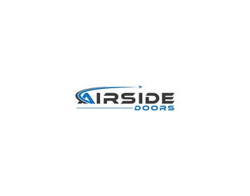
AirSide Doors- NEW LOGO CONTEST
- État: Closed
- Prix: $125
- Propositions reçues: 60
- Gagnant: CircleDesign24

Résumé du concours
We want to change the look of our company logo. We specialize in aircraft hangar and large architectural doors.
I included a copy of our current logo and our team looks forward to some interesting designs .
Keep the following design comments in mind.
1. We don't want to see paper airplanes as part of the logo
2. We don't want to see commercial jetliners as part of the logo
3. Simple, clean and forward think is critical of a winning design
4. Designs should never have actions that flow left when done in the English language, always flow to the right
Good luck to all designers.
Compétences recommandées
Commentaire de l'employeur
“Job well done. With nearly 500 entries, the contest was challenging. It was nice to deal with someone focused only on quality and professionalism.”
![]() gbergstrom67, United States.
gbergstrom67, United States.
Tableau de clarification publique
-

cdd1234
- il y a 6 ans
Well good luck with your generic logo.
- il y a 6 ans
-

sanychohan1992
- il y a 6 ans
https://99designs.com/logo-design/contests/cutting-edge-drone-operation-700341/entries/139
winning design is copied from here- il y a 6 ans
-
Ethnocentric
- il y a 6 ans
Thanks. Yes, only your link is real. Thanks again.
- il y a 6 ans
-

paijoesuper
- il y a 6 ans
You right..It turns out the winner of this contest is not original just get the copy logo ... congratz
- il y a 6 ans
-

Rabbi6309
- il y a 6 ans
thanks you
- il y a 6 ans
-

ConceptStudio20
- il y a 6 ans
Ethnocentric font use ....
nowdays most designer use this font...
it's look good- il y a 6 ans
-

umewefuture
- il y a 6 ans
nice design...but it's common now days...|
you should try to design better thing..- il y a 6 ans
-
Ethnocentric
- il y a 6 ans
At last, you chose a winner and the same font 'Ethnocentric' Nice
- il y a 6 ans
-
sanychohan1992
- il y a 6 ans
thanks shipra
- il y a 6 ans
-

CreateUniqueDSGN
- il y a 6 ans
Sir if you want to buy my entries so I set the price for you thank you
- il y a 6 ans
-
Ethnocentric
- il y a 6 ans
Please check #530 , #531 , #532
- il y a 6 ans
-

shapegallery
- il y a 6 ans
#extended
- il y a 6 ans
-

Design Point
- il y a 6 ans
#536
- il y a 6 ans
-

markmael
- il y a 6 ans
- il y a 6 ans
-
markmael
- il y a 6 ans
please check my new entry ch
- il y a 6 ans
-

Lailatunnahar
- il y a 6 ans
Please cheek my entry#492
- il y a 6 ans
-
Lailatunnahar
- il y a 6 ans
please cheek my entry# 489
- il y a 6 ans
-
Lailatunnahar
- il y a 6 ans
please cheek my entry.
- il y a 6 ans
-

zouhairgfx
- il y a 6 ans
Entry #490 #491
- il y a 6 ans
-

Titulaire du concours - il y a 6 ans
#479 ... Your plane looks like it is crashing
- il y a 6 ans
-
Titulaire du concours - il y a 7 ans
I don't understand why it seems so many people are using the same font. That tapered E is not the best in my opinion.
- il y a 7 ans
-
Ethnocentric
- il y a 7 ans
Because you Rate this font 5star. So all realize, you really like this font and they used the same font in their design.
- il y a 7 ans
-
Ethnocentric
- il y a 7 ans
If you want another font or idea, please private message me. I show you many logo ideas. Thanks
- il y a 7 ans
-

hoogabooga
- il y a 7 ans
There are some really goof designs, but all the top rated designs have the same font "Ethnocentric". Event i have used the same font in one of the designs and i feel it takes away the uniqueness and innovation from the design as the font is very common, I see the same font in every second logo competition. As a desginer I am not very proud that I went with the crowd. I feel all the contests must be sealed to avoid plagarism. I am a fresher I wish I could bring more Innovation.
Regards.- il y a 7 ans
-
Titulaire du concours - il y a 7 ans
Yes, your font is fresh and I do like your work. let's see if the public does as well before I award the contest
- il y a 7 ans
-

oronfel2911
- il y a 7 ans
please check this one https://ibb.co/fCCAmQ
- il y a 7 ans
-
Titulaire du concours - il y a 7 ans
Interesting.
- il y a 7 ans
-

Mithuncreation
- il y a 7 ans
Please check Entry #454, #456
- il y a 7 ans
-
zouhairgfx
- il y a 7 ans
Entry #473 #474
- il y a 7 ans
-
zouhairgfx
- il y a 7 ans
Entry #471 #472
- il y a 7 ans
-

nazish123123123
- il y a 7 ans
#467 thanks
- il y a 7 ans
-

JoseValero02
- il y a 7 ans
check #460 #462
- il y a 7 ans
-
JoseValero02
- il y a 7 ans
check #460 please
- il y a 7 ans
-

linhsau1122
- il y a 7 ans
and #457
- il y a 7 ans
-
linhsau1122
- il y a 7 ans
Please check #455 #453
- il y a 7 ans
-

azhanmalik360
- il y a 7 ans
- il y a 7 ans
-
azhanmalik360
- il y a 7 ans
- il y a 7 ans
-

designguru4237
- il y a 7 ans
#441
- il y a 7 ans
-
designguru4237
- il y a 7 ans
check #439 #440
- il y a 7 ans
-
cdd1234
- il y a 7 ans
Nice generics ... all copying the same concept!
- il y a 7 ans
-
Titulaire du concours - il y a 7 ans
We want a clean and simple design. If you have something that is not cluttered, please submit it. Thank you
- il y a 7 ans
-

deep844972
- il y a 7 ans
Please check #282 #283 #284 #285 thannks
- il y a 7 ans
-
CreateUniqueDSGN
- il y a 7 ans
why you put my entry numbers this is my entry numbers #282 #283 #284
- il y a 7 ans
-

maanojam
- il y a 7 ans
Check #394 #395
- il y a 7 ans
-
CreateUniqueDSGN
- il y a 7 ans
Please check #372 #373 #374 #375 #376 #377 #378 ..Thanks.
- il y a 7 ans
-

farukparvez
- il y a 7 ans
CHECK#365.366
- il y a 7 ans
-
farukparvez
- il y a 7 ans
check#363.364
- il y a 7 ans
-
azhanmalik360
- il y a 7 ans
Check #329 #330 #331 #332 #333 #334
- il y a 7 ans
-
Titulaire du concours - il y a 7 ans
They look good. I would prefer that you consolidate them because it increases the number of submissions too much
- il y a 7 ans
-
azhanmalik360
- il y a 7 ans
okay
- il y a 7 ans
Comment commencez des concours
-

Publiez votre concours Rapide et facile
-

Obtenez des tonnes de propositions De partout dans le monde
-

Attribuez la meilleure proposition Télécharger les fichiers - Facile !