Tableau de clarification publique

  • funcrab
    Titulaire du concours
    • il y a 6 ans

    Nice! Two things I've been thinking could make this work better:
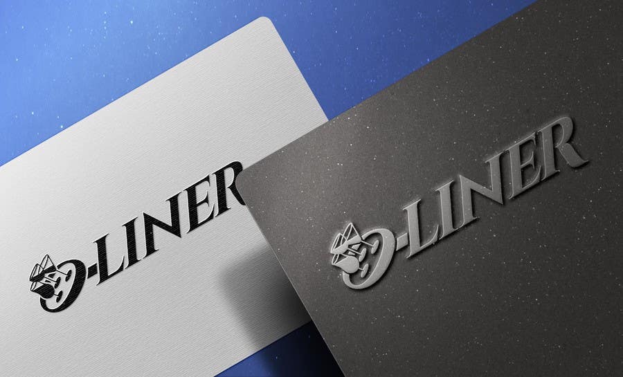
    a) change the glassware for 3 champagne flutes. I uploaded a .jpg of one I like the tulip shape. Can you design it so it looks 2/3 full, angled the same way as before with the fluid being horizontal?
    b) The O and the LINER still look a little detached. Can you please align the O with the LINER, so the letters are on the same level? Also, could you please angle the LINER the same way as the O. Maybe a Sans Serif font would look better?

    • il y a 6 ans
    1. sinzcreation
      sinzcreation
      • il y a 6 ans

      I will apply all theses changes

      • il y a 6 ans
  • funcrab
    Titulaire du concours
    • il y a 6 ans

    I like how the right leg of the R stretches out to 'balance' the word

    • il y a 6 ans
    1. sinzcreation
      sinzcreation
      • il y a 6 ans

      Did you notice that? Woau, you are an Eagle eye

      • il y a 6 ans