Tableau de clarification publique

  • JaneBC21
    Titulaire du concours
    • il y a 4 ans

    If I award you the job now, can you promise to make these changes please?

    • il y a 4 ans
  • JaneBC21
    Titulaire du concours
    • il y a 4 ans

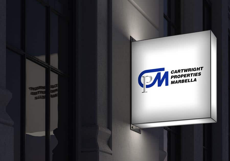
    Maybe try CARTWRIGHT PROPERTIES on the same line (in blue) and MARBELLA under it in the same metallic grey. I'd like to see the blue of the C & M in the logo darker and metallic (CARTWRIGHT PROPERTIES in the same darker metallic blue)? Can you do two examples: 1 - with the word MARBELLA centered under CARTWRIGHT PROPERTIES and 2 - with MARBELLA stretched to the same length as CARTWRIGHT PROPERTIES?

    • il y a 4 ans
  • JaneBC21
    Titulaire du concours
    • il y a 4 ans

    I can't see the real shade of grey of the 'P' because of the light behind it. Can I please just see the whole thing on a plain white background, like a business card?

    • il y a 4 ans
  • JaneBC21
    Titulaire du concours
    • il y a 4 ans

    Hi Surovyaktar - The only one I'm interested in is 153. I will be using it on my website and on a business card. Can I see it just on plain white please. Did you change the blue? It looks the same shade to me. The words I don't like in black at all. I wonder it the 'M' in the logo will look better more rounded at the top - what do you think?

    • il y a 4 ans