Logo Design for Tea Shop (Gongfu Cha)

  • État: Closed
  • Prix: $100
  • Propositions reçues: 99
  • Gagnant: SheryVejdani

Résumé du concours

We need a logo for our webshop concerning Tea.

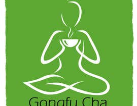
The title "gongu cha" means "art of preparation & presentation of tea". Literally you can also translate it as "making tea with effort".
Preparing the tea is like a mastership, which is aesthetic, philosophical and harmonic. Like Meditation.

The logo should be SIMPLE, DISCREET, HARMONICALLY & CLEAN.

That's why it should have maximum 3 discreet colors. Since we need to print it very small, the detail level should be not too high. Creating more of an idea or a scheme, than a concrete design... See the fox image as an impression.

On the image with the "TEALEAFS.JPG", we especially like the pureness of the logo. Its simple, but one instantly knows its about tea.

We need this kind of idea for gong fu cha. Since you find all elements of gongfu in meditation, we think of a silhouette or pure image of a meditating human, holding a cup of tea. The more simple the picture is, the better.

As elements one can work with is "steam" - "gaiwan" - "meditation" -

The logo can contain the words "Gongfu Cha" as long as it stays under above guidance.


Please NOimages of leafs & teapots & european teacups! - We would like to stand out and be unique :)

Compétences recommandées

Commentaire de l'employeur

“Shery did an absolutely professional job. Although we had different wishes and many steps on our projects with absolutely different demans she always kept her cool and finished everything in time. We absolutely appreciate what she has done for us and would always work again with her. When you need a good Design, trust her!”

Image de profil wudesigns, Germany.

Tableau de clarification publique

  • alizainbarkat
    alizainbarkat
    • il y a 11 ans

    check #151 & #152

    • il y a 11 ans
  • wudesigns
    Titulaire du concours
    • il y a 11 ans

    Hello everyone!
    We thank everybody so far for the nice ideas. Sorry for being so strict, but we had a clear image in our minds where it should go to. Right now #139 is our absolute favourite. Just some small adjustments need to be done, then it will be perfect for our needs. When someone has an absolute killer approach he can surely submit it, but right now it should beat this image and also go into this direction. Maybe someone has a more creative approach, than he can try :)
    Thanks everyone for all of your pictures!

    • il y a 11 ans
    1. Mehran53
      Mehran53
      • il y a 11 ans

      congratulation sherry :-)

      • il y a 11 ans
    2. SheryVejdani
      SheryVejdani
      • il y a 11 ans

      thanx Mehran

      • il y a 11 ans
  • mdibyendu
    mdibyendu
    • il y a 11 ans

    Give up.......

    • il y a 11 ans
    1. wudesigns
      Titulaire du concours
      • il y a 11 ans

      Sorry over there, I know its a hard task and we have special requirements for this logo.
      Thanks nevertheless for your effort! Have a nice time and greetings :)

      • il y a 11 ans
  • creativeartist06
    creativeartist06
    • il y a 11 ans

    My updated design
    CA

    • il y a 11 ans
  • wudesigns
    Titulaire du concours
    • il y a 11 ans

    Since only a few people seem to read the Brief above maybe its good to post it here too :)
    We really like some approaches to the logo. But yet there is noone which absolutely is what we had in mind... Some people understand the clean design we desire, these are the highest rated ones.

    But we wanted to distinguish us from the other tea shops out there. And having a teacup in our logo makes us probably 99% equal to all others :)

    Check the idea what I posted in the Brief... When you would be a guest on a traditional tea ceremonie and an old wise master would sit and prepare tea for you. He would do it slowly, every movement is perfect, calm, minimalistic and precise. No movement is in vain...

    This kind of thought needs to be captured in an image in a creative, simple and clean approach. As the style of #52 or #29 for example... Hope this helps... Thanks to everybody for the effort!

    • il y a 11 ans
    1. designdecentlogo
      designdecentlogo
      • il y a 11 ans

      plz check 57and 58

      • il y a 11 ans
    2. wudesigns
      Titulaire du concours
      • il y a 11 ans

      Argh sorry but please check the Brief & the Comments here... Noooo european teacups please :)

      • il y a 11 ans
  • wudesigns
    Titulaire du concours
    • il y a 11 ans

    Thats true, sorry for that. But we are rating the best style and the people always come up with teapots, teacups and leafs :(
    We right think #85 is best, since it goes into the direction we actually want & it has a very nice and decent style, which we except from a logo!

    • il y a 11 ans
  • mdibyendu
    mdibyendu
    • il y a 11 ans

    Hi Ch !
    What you want it is not clear to me, I read so many times but now I am confused, because in project brief you say that "Please NOimages of leafs & teapots & european teacups! - We would like to stand out and be unique :)" but you r rating most with leaf :(

    • il y a 11 ans
  • aqeelmehboob
    aqeelmehboob
    • il y a 11 ans

    Please check #84.thanks

    • il y a 11 ans
  • creativeartist06
    creativeartist06
    • il y a 11 ans

    attached my design

    CA

    • il y a 11 ans
  • wudesigns
    Titulaire du concours
    • il y a 11 ans

    Hey softprize and everybody else,
    thanks for the hint with the "sealed" addon, I might reconcider it, when there comes in a design which gets close to what we want. But right now every design is far away from it :(
    Please reread the briefing. And take a look at "tealeafs.jpg".

    We need that kind of simple and clan design. Everything right now is much too complicated and too playfull. Colorgradients make things too complicated. Thee more simple the better here! #19 is nteresting, But please use no european teacups, I will update the briefing again so things get more clear!
    Please read the briefing!
    Thanks so far to everybody for the ideas...

    • il y a 11 ans
    1. softprize
      softprize
      • il y a 11 ans

      Please, look at #51 , I'm using the G shape to create the chinese teacup

      • il y a 11 ans
  • softprize
    softprize
    • il y a 11 ans

    Please, check my entry #51 . Please, let me know any suggestion.

    • il y a 11 ans
  • kgruszecka
    kgruszecka
    • il y a 11 ans

    Please check my entry #50 and please comment, thanks.

    • il y a 11 ans
  • SheryVejdani
    SheryVejdani
    • il y a 11 ans

    Hi, Please check #32 , #33 , #34. thanks

    • il y a 11 ans
  • ahmad1615
    ahmad1615
    • il y a 11 ans

    Please check #31 . Thanks.

    • il y a 11 ans
  • softprize
    softprize
    • il y a 11 ans

    In order to avoid the stealing of ideas and you could get a fresh and new ones. Could you consider seal the contest? Seal process hides our proposals from others.

    • il y a 11 ans
  • vksalian
    vksalian
    • il y a 11 ans

    I recently updated an image on this page. But I could not see if the image has been accepted or successfully uploaded.

    • il y a 11 ans

Montrer plus de commentaires

Comment commencez des concours

  • Publiez votre concours

    Publiez votre concours Rapide et facile

  • Obtenez des tonnes de propositions

    Obtenez des tonnes de propositions De partout dans le monde

  • Attribuez la meilleure proposition

    Attribuez la meilleure proposition Télécharger les fichiers - Facile !

Publier un concours maintenant ou rejoignez-nous maintenant !