Tableau de clarification publique

  • brandfashion
    Titulaire du concours
    • il y a 10 ans

    I like the style of the writing from #19 . Perhaps you can do the same.

    • il y a 10 ans
    1. anastasiastacey
      anastasiastacey
      • il y a 10 ans

      I'm working on changes! It will be ready during the day! I'll try to do my best :)

      • il y a 10 ans
  • brandfashion
    Titulaire du concours
    • il y a 10 ans

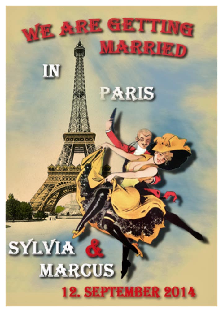
    Hi, I think the windmill is too much. But if you can do the other changes it would be fine. Thank you!!

    • il y a 10 ans
  • brandfashion
    Titulaire du concours
    • il y a 10 ans

    And maybe: Can you put in the backround the windmill of Moulin Rouge. But I don´t know how it Looks like. So it is the best: One design with and one without the windmill. Thanx a lot!!!!!

    • il y a 10 ans
  • brandfashion
    Titulaire du concours
    • il y a 10 ans

    Some changes: Please make a Frame, I like the design elements on the top and bottom of the design from Miguel, the font and script has to be Change: The font must mor be like the examples - and not in a Linie and some scripts bigger and some smaler. You are one the right way... :-)

    • il y a 10 ans
  • brandfashion
    Titulaire du concours
    • il y a 10 ans

    Hi, thany for your design. It´s now the best one.

    • il y a 10 ans

Montrer plus de commentaires Traitement en cours...