Freelancer : jk94
Partager :
Signaler la proposition

More Entries

1. about the logo - I uploaded several formats (horizontal, circular, white fade, blue fade). If you have any other ideas/comments, just tell me. 2. About the blue bar -- I made them fade uniformly throughout, but too much fading will make the text hard to read, as the font you have given is quite thin. Because of this, I made some versions with black and white backgrounds, so that the text and the woman will stand out more. 3. Background blurring - I lessened the blur on the background (generally), but retained the blur for the parts behind the blue bar, again to boost the readability of the text. If you have any other comments/requests, please tell me and I will get back to you ASAP. Thank you very much.
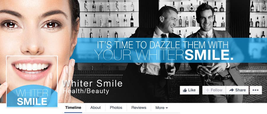
Proposition n°86 du concours                                                 Design a Cover Photo for our Facebook Page
Proposition n°86

Tableau de clarification publique

  • phpftw
    Titulaire du concours
    • il y a 9 ans

    Thank you, that blue bar is perfect now. Really like the look of it. Can't decide if I prefer the colour or b/w background! Both look good. I'll need to think about the logo in the profile pic, it's a little hard to incorporate it in a way that makes it look really good (same with the designs from other people). I would prefer the profile pic not just show teeth because it's a little stereotypical and not unique enough. It's a bit of a tough one to work out what to do. See how this page for example use their favicon instead of a business name https://www.facebook.com/freedomAU. Do you think our favicon could be incorporate in any way? Our favicon is actually a WS but positioned in a way of a smile. I'll add the favicon design to the brief if you want to see if you can do something with that.

    • il y a 9 ans