Tableau de clarification publique

  • brettbsl
    Titulaire du concours
    • il y a 10 ans

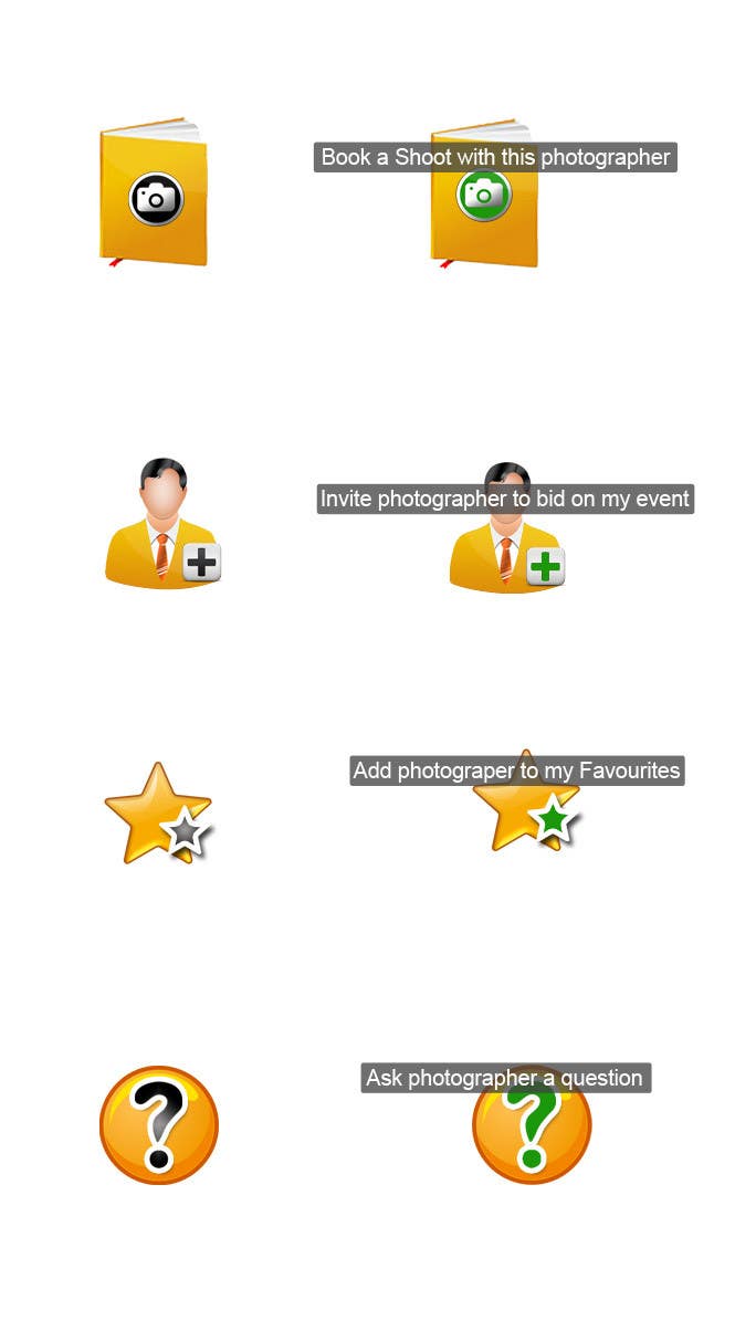
    I definitely like the direction you are going with these. We did exactly as I described. Maybe instead of a book for the Booking icon, could it be a calendar with grids and a camera on a particular date. After thinking about it, a calendar may make more sense than a book. I also, like how on mouseover, it will change color. I also think the invite photographer icon does not look like a photographer. Photographers aren't typically wearing ties. If that could be made to look more like a photographer, that would be great. The other two icons are acceptable, if you did have other creative ideas to add that would be great. I am also unsure how the gold and green will look with my site colors which are primarily dark and light blue. I am open to more creativity. Thank you.

    • il y a 10 ans
    1. nigiiqbal
      nigiiqbal
      • il y a 10 ans

      Thanks for the positive feedback. I have some other ideas that I will work on tomorrow and hope that would be up to par. Kind regards nigiiqbal .

      • il y a 10 ans