Top Song | Logo Concept & Design Brief
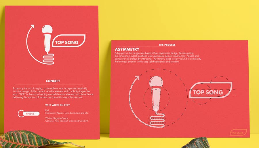
Concept: To portray the act of singing, a microphone was incorporated explicitly in to the design of this concept. Another element which solicitly targets the word “TOP” is the arrow looping around the main element and above hence delivering the emotion of success and pursuit to reach that success. Asymmetry: A big part of this design was based off an asymmetric design. Besides giving the concept an overall aesthetic look; asymmetry depicts imperfection, natural and being over all profoundly interesting. Asymmetry tends to carry a kind of complexity that conveys emotion; in this case lightheartedness and joviality. WHY WHITE ON RED? Red Represents: Passion, Love, Excitement and Life. White/ Negative Space Conveys: Pure, Peaceful, Clean and Goodwill.


