Icon or Button Design for Etrege Marketing Solutions
- État: Closed
- Prix: $140
- Propositions reçues: 15
- Gagnant: santiagodurieux

Résumé du concours
We are an online auction site. A place for people to sell and buy.
Compétences recommandées
Commentaire de l'employeur
“Amazing work and talent!”
![]() geoeng, Sri Lanka.
geoeng, Sri Lanka.
Tableau de clarification publique
-

santiagodurieux
- il y a 11 ans
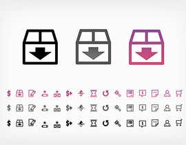
Hi there, I uploaded a visual so you can appreciate the transparencies and colors, I developed all icons in Black, Gray and Color. They are made in vector format so it can help to enlarge or reduce it ... greetings.
- il y a 11 ans
-

Breena78
- il y a 11 ans
Just wanted to know if you need the icons to be colourful like you attached or in single solid colour? Single solid looks more sofisticated but it totally depends on the look of the page where you are going to use it.
- il y a 11 ans
-

Titulaire du concours - il y a 11 ans
The following icons should have two views that is the "Transparent view" & "Colorful view"
1) Checkout complete
2) Item Paid
3) Item Shipped
4) Confirm receipt
5) Left Feedback
6) Feedback Received
The rest of the icons should be in "Colorful view". We have attached a preview page of the site, you can find it on our contest briefing. Thank you.- il y a 11 ans
-

AnaCZ
- il y a 11 ans
Dear contest holder, please reject #3 - its clipart from the internet. I have already indicated the link where I saw the icons from this same series.
If you are serious about attracting good designers to this contest we need to be reassured that you will not tolerate fraud in this contest.- il y a 11 ans
-

ashishpatel1992
- il y a 11 ans
I have withdrawn the design. I respect the originality of the work. I didnt knew if we could modify & submit. Will work on my original ideas now.
- il y a 11 ans
-
AnaCZ
- il y a 11 ans
Thank you ashishpatel1992.
Now it's fair game again :-)- il y a 11 ans
-
Titulaire du concours - il y a 11 ans
Dear Contestants, we are in need for a much more better design than the above submitted ones. Please be innovative and creative. Comparing to our attached file icons and your design, our attached icons are far more better. This is a kind request to you all, please design us a professional looking sophisticated icons. It should be your own design and not copying from other website or places.
- il y a 11 ans
-
ashishpatel1992
- il y a 11 ans
Hi,
Could you please provide the website link where you want to place the icons so that I can match the design.
Regards,
Ashish- il y a 11 ans
-
Titulaire du concours - il y a 11 ans
Hi, we have attached a preview of the site. Please find the screenshot on our contest briefing. Thank you.
- il y a 11 ans
-
Titulaire du concours - il y a 11 ans
Dear Designers,
We would like to have a design as shown in our attachment (not the same, but in a different way). The icons should be done at 16x16.
Do not design these icons above the dimension or size 16x16 or do your design above the required size and then resize it to 16x16 as it would give a blurry effect.
Regards,
geoeng- il y a 11 ans
-
AnaCZ
- il y a 11 ans
Dear contest holder. With all the respect please slow me to make a tecnical clarification:
Designs are always made in larger sizes than the final size. It is impossible to draw a miniature icon in real size. However, there are good and bad ways of shrinking a design. The good way is when the original image is a vector image, which is a format that allowes sizing up or down with no loss of quality. The bad method is everything else that does not use vector.
I hope this was helpful information.- il y a 11 ans
-
AnaCZ
- il y a 11 ans
Dear Contest Holder,
please check #9. This is a Photoshop tutorial website I was checking out for additional training. Please take a careful look at the shopping basket inside the red circle.
Now check out the shopping basket in the "design" #3 submitted in this contest.
I'm also posting here the link to the tutorial website, in case you wish to take a closer look and compare:
http://graphicriver.net/item/realistic-building-logo-sign-mockup-2/3098375
I leave the rest top to you.
Sincerely,
Ana Zivick.- il y a 11 ans
-
Titulaire du concours - il y a 11 ans
Dear contestants, We will not let anyone copy your designs. If we find anyone copying anyone of the above designs you owe, we will reject those designs. If you find anyone copying your designs, please report them to us. We are unable to seal this contest due to the need of getting the most best designs we require. You always have the option to "opt-out" or "Withdraw" from this design contest at anytime you wish.
- il y a 11 ans
-
Titulaire du concours - il y a 11 ans
Dear participants, We are requiring you to design 15 icons. In order for us to choose the best out of all designs, we need to see all 15 icons. When you are designing these icons, indicate its relevant representation next to it, so that it would be easier for us to identify.
- il y a 11 ans
-

ReehaZakir
- il y a 11 ans
Hello sir, is it possible to seal the contest ? to avoid copy theft ?
- il y a 11 ans
-

ceruleusX
- il y a 11 ans
I agree
- il y a 11 ans
-
AnaCZ
- il y a 11 ans
Dear contest holder,
Please check #4 (not a submission). This is your website (under construction). I also found your company in Facebook.
Now here come my questions:
Are you keeping the icon with the shopping cart?
Will the website have the same look as in #4?
The reason for these questions is that I want to make sure that I will design icons in a style that will work beautifully with your website. We don't want the style of the icons to visually conflict with the style of the website.
You can reject #4. It was only to visualize my question.
Thank you
Ana- il y a 11 ans
-
ashishpatel1992
- il y a 11 ans
Please rate 3#. Thanks
- il y a 11 ans
-
Titulaire du concours - il y a 11 ans
We have updated our attached file. Please read the attachment carefully and design accordingly. Any questions feel free to ask. Thank you.
- il y a 11 ans
-
ceruleusX
- il y a 11 ans
Just swap third and fourth icon (best offer and classified ad). Upper are default, downer are hover. I would like to get feedback . positive or negative. Thanks.
- il y a 11 ans
-

didiwinata
- il y a 11 ans
feedback please.
- il y a 11 ans
Comment commencez des concours
-

Publiez votre concours Rapide et facile
-

Obtenez des tonnes de propositions De partout dans le monde
-

Attribuez la meilleure proposition Télécharger les fichiers - Facile !