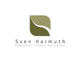
Design eines Logos für SvenHarmuth
- État: Closed
- Prix: €54
- Propositions reçues: 59
- Gagnant: AnaCZ

Résumé du concours
I need a Logo ...
for a startup of a one man company working for motivation, guidance in fitness and nutrition (good food)
No Apples (fruits) more special ... find something for fitness and motivation and healthy look.
Name: Sven Harmuth
Claim (under): Ernährung, Fitness, Motivation
Some Impressions you find attached
Compétences recommandées
Tableau de clarification publique
-

ijimlyn
- il y a 10 ans
also solid color #178 m thanks
- il y a 10 ans
-
ijimlyn
- il y a 10 ans
Hi contest holder please check #177 . thank you
- il y a 10 ans
-

rdesignr
- il y a 10 ans
Hi Hunter74 give me feedback for #171
- il y a 10 ans
-

Titulaire du concours - il y a 10 ans
Please son´t post Logos 50 times, i will reject them. !!!
- il y a 10 ans
-

iftawan
- il y a 10 ans
hello hunter74 it was my mistake by posting entry to you stupid contest and you are rejecting designs and i am losing xp points please let poor logos beeeeeeeeeeeee thanks
- il y a 10 ans
Voir 2 messages supplémentaires
-
AnaCZ
- il y a 10 ans
@iftawan
I think this contest is a little different. The CH is a designer himself and I think this is a little bit like a group of designers gathering together every day during an entire week to brainstorm until their brains run dry. It's something one would do rather for the sake of participating in a research experiment than for the money.
I think that designers who are struggling with making a living would be better rewarded for their efforts in a higher prized contest, since as you mentioned, a lot of hours are poured into this contest. It only makes sense staying here if you can do it for fun, not for putting bread on the table.
Don't get me wrong, tomorrow I will no longer be here - I will be working for my bread too.
But today, I still have a little time left for this "less equals greater" design challenge. Because it's really not that easy to make something great while using less.- il y a 10 ans
-
AnaCZ
- il y a 10 ans
But I'm here to learn :-) Because the more we learn, the more we realize how much more we can still learn :-)
- il y a 10 ans
-
Titulaire du concours - il y a 10 ans
It should be flat, I am a fan of clean and reduced Design so it is more Timeless!
- il y a 10 ans
-
AnaCZ
- il y a 10 ans
Hi Hunter,
I need to know if your customer wants the logo colors to be flat or with effects.
Could you check #123 and tell me what you think?
Danke- il y a 10 ans
-

FlyersFan
- il y a 10 ans
Based on your profile, you're a graphic designer. So, you pay one of US $50 and get $250 from a client. Nice. I never thought of that.
- il y a 10 ans
-
AnaCZ
- il y a 10 ans
Ah, and obviously the customer knew that I was outsourcing. I had no intention of claiming it as my own design.
The funny thing is, people didn't enter, possibly because they got suspicious. So I ended up making the logo myself and asking helpdesk to close the contest.- il y a 10 ans
-
Titulaire du concours - il y a 10 ans
who says, that I am get 250$ that´s not right. It is a very Small budget. I have to do a lot of more stuff.
No one needs to participate to the contest! For me its just a brainstorming thin. I have to and want to finalice some Entries.
But at least I thought thois morning about raising up the budget, because a lot of people here do good and hard work!- il y a 10 ans
-
ijimlyn
- il y a 10 ans
Hi Hunter, please check #115 . Thanks. :)
- il y a 10 ans
-
AnaCZ
- il y a 10 ans
Hi Hunter,
I would like to discuss with you the difference in rating between my #13 (3 stars) and the options I submitted after that #62 #69 (1 star).
Clearly I'm not going in the right direction with my design, in part because it's hard to second guess your preferences without talking about them.
If you could find the time to send me a personal message for a quick chat about the designs, it would be great and very helpful.
Thanks,
Ana- il y a 10 ans
-
Titulaire du concours - il y a 10 ans
Yes, your designs are very clear, that´s what I like. But the Green Cube, is a little bit too hard for the Theme: Motivation, Fitness, Nutrition . I like the Type and everything in it!! Maybe try to make it on a few corners with rounded corners? Maybe not on all.
- il y a 10 ans
-
AnaCZ
- il y a 10 ans
Thanks, Hunter.
Your feedback was very helpful.- il y a 10 ans
-
Titulaire du concours - il y a 10 ans
Not yet that kind of cool logo, that represents - Nutrition, Fitness, Wellness, Motivation. The Person is a Manager!!
- il y a 10 ans
-
ijimlyn
- il y a 10 ans
Hi CH, please check #84
regards. :)- il y a 10 ans
-

Superiots
- il y a 10 ans
please #72 #73
thanks and regards- il y a 10 ans
-

frozentoast
- il y a 10 ans
Check #8.
Regards- il y a 10 ans
-

zaikh13
- il y a 10 ans
many logo projects, lot of money ;)
http://fr.wilogo.com/?pcode=86940243- il y a 10 ans
-
Titulaire du concours - il y a 10 ans
Hi Guys, it should be more clean and serious - a bit of Business / Management - Look as well on the Impressions attached
- il y a 10 ans
-
frozentoast
- il y a 10 ans
#8 & #20 full screen :)
Regards.- il y a 10 ans
-
zaikh13
- il y a 10 ans
many logo projects, lot of money ;)
http://fr.wilogo.com/?pcode=86940243- il y a 10 ans
-
Sulfur6
- il y a 10 ans
Hello, please check #29 and let me know what you think. Thank you.
- il y a 10 ans
-
zaikh13
- il y a 10 ans
many logo projects, lot of money ;)
http://fr.wilogo.com/?pcode=86940243- il y a 10 ans
-

ronelmanzanilla
- il y a 10 ans
awesome #34..
- il y a 10 ans
-
zaikh13
- il y a 10 ans
many logo projects, lot of money ;)
http://fr.wilogo.com/?pcode=86940243- il y a 10 ans
-
ronelmanzanilla
- il y a 10 ans
look at # 44
- il y a 10 ans
-
zaikh13
- il y a 10 ans
many logo projects, lot of money ;)
http://fr.wilogo.com/?pcode=86940243- il y a 10 ans
-
AnaCZ
- il y a 10 ans
Hi Hunter, thanks for the rating on #13.
If you could take a second or two to provide me some written feedback, it would be great and it would help me better understand in which direction to go.
Thanks,
Ana- il y a 10 ans
-

shemulehsan
- il y a 10 ans
Look at Entry #63. I think it will come to your expectation.
- il y a 10 ans
-

atikur2011
- il y a 10 ans
Please check #54
- il y a 10 ans
-

littleladyju
- il y a 10 ans
Have a look at #40, please ;)
- il y a 10 ans
-
Superiots
- il y a 10 ans
great
- il y a 10 ans
-
littleladyju
- il y a 10 ans
thanks ;)
- il y a 10 ans
-

sasiulian
- il y a 10 ans
Take a look at #2 see what I do for your contests.
Regards- il y a 10 ans
-
sasiulian
- il y a 10 ans
And to be a stalker is fine? Work for your credits don't push other from back...Thanks and this is the last answer for you....Regards and sorry for say "shut up"
- il y a 10 ans
-
AnaCZ
- il y a 10 ans
Never had the intention of stalking you. I just get very tired of all the fraudulent behavior on this site.
So when I saw the same logo twice...
But I'm going to leave you alone- il y a 10 ans
-
Titulaire du concours - il y a 10 ans
It isn´t easy to find the correct Images- the 3 Points from frozentoast are good
- a combination from Fitness, Nutrition and Motivation makes you Successfull in Live, Job and getting women ;-)- il y a 10 ans
-
frozentoast
- il y a 10 ans
Thank you ! Much Appreciated !
- il y a 10 ans
Comment commencez des concours
-

Publiez votre concours Rapide et facile
-

Obtenez des tonnes de propositions De partout dans le monde
-

Attribuez la meilleure proposition Télécharger les fichiers - Facile !