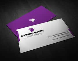
Mind Reading entertainer needs business cards!

  • État: Closed
  • Prix: $30
  • Propositions reçues: 2
  • Gagnant: AbdullahArnab

Résumé du concours

Connor Jacobs is an Australian mind reader and thought sculptor. This year he is entering new markets, targeting the corporate speaking and entertainment sector with his unique offering of mind reading demonstrations and psychological influence.

The turnaround process in this business is set to last for the next 18 months, but at this stage, Connor is looking to quickly build a few stop-gap measures to allow him to meet, entertain, and engage potential new clients. One element of this is a temporary design of business cards that will be able to be printed quickly, ready for some imminent exhibitions and conferences. At this time, due to the transient nature of the business image and corporate design, he is not looking for incredible or outstanding efforts, but is hoping that this quick and low-prize crowdsourcing contest will turn up something eye-catching and memorable for the time being. He is not expecting freelancers to devote hours of time to this project, as there is only a small reward on offer. HOWEVER, should good design concepts and cooperative designers start to show themselves, there will definitely be opportunities for larger-scale branding design work before the end of this year.

PROJECT DETAILS:
- Standard-sized business cards (92x60mm art, which includes 3mm bleed. Please account for an extra 3mm safe zone border).
- MUST have blank white back
- Plain black-on-white design is okay, OR...
- If colour is used, please include only black, white and rich purples (see colour scheme at http://www.connorjacobs.com ), in a CMYK palette
- NOT looking for clip art style graphics!
- Style that is masculine, clear and uncrowded. A bit of modernism without ruining the professionalism
- Happy to see interesting or experimental fonts, but NOT looking for script, handwriting, cartoon or overly-"blocky" fonts (such as Bauhaus or Elephant).
- Imagery or backgrounds are up to you. Ideas relating to thought, the mind, neural networks, electricity, joining, connection, surprise or entertainment are all open to you, but clichés such as lightbulbs will probably not be accepted.
- There is currently no logo to work with, so a visually appealing presentation of ONE aspect of the card would be encouraged, perhaps a monogram?


NECESSARY INFORMATION TO BE INCLUDED
Please ensure the following text is used in your design, in whichever order or layout you decide:
- Connor Jacobs
- Thought Sculptor
- http://www.connorjacobs.com
- 0412 0 THINK (0412 084 465)
- Mundus vult decipi, ergo decipiatur

Although the website is currently incomplete, we encourage designers to look at http://www.connorjacobs.com to get a feel for what Connor does.

Thank you for your interest. We look forward to viewing your ideas. We will seek to give feedback during the week, but we would encourage you to try ideas before asking questions - we are quite open to new ideas, or things that deviate slightly from the above brief. Creative and trustworthy entrants will be noted for future work proposals.

Compétences recommandées

Commentaire de l'employeur

“AbdullahArnab provided an imaginative and original design for our business card project, perfectly in line with the brief. They have designed an original and appropriate concept logo for the cards which is very appealing. As a clear and polite communicator, we will be happy to hire AbdullahArnab again for further associated work.”

Image de profil MisterLloyd, Australia.

Tableau de clarification publique

  • maruffislamm
    maruffislamm
    • il y a 10 ans

    Congratulation Abdullah Arnab.

    • il y a 10 ans
  • maruffislamm
    maruffislamm
    • il y a 10 ans

    hello , #45 color can be changed on final delivery if you really like the concept .

    • il y a 10 ans
  • maruffislamm
    maruffislamm
    • il y a 10 ans

    pls check #51.

    • il y a 10 ans
  • MRKSolutions
    MRKSolutions
    • il y a 10 ans

    Hi! Something different for you to consider in #46 and #47. Thanks!

    • il y a 10 ans
  • maruffislamm
    maruffislamm
    • il y a 10 ans

    pls check #44 , #45 . Thanks.

    • il y a 10 ans
  • AbdullahArnab
    AbdullahArnab
    • il y a 10 ans

    #38 Back- Logo in one corner. Only the "Mundus" in Italic. (Color: Purple)
    #39 Back- Logo in one corner. Only the "Mundus" in Italic (Color: White)
    #40 back- logo in center. Total White.
    #41 same as #35 but "Mundus" word in Italic
    #42 "Mundus vult decipi, ergo decipiatur" in Italic.
    I have also made the "Mundus vult decipi, ergo decipiatur" smaller than before.

    I didn't understand,you need only the word 'Mundus" in Italic? or "Mundus vult decipi, ergo decipiatur" in Italic?
    What you need,will be corrected on Final Design.

    Thanks in advance

    • il y a 10 ans
    1. MisterLloyd
      Titulaire du concours
      • il y a 10 ans

      Sorry for being unclear. I had meant the whole "Mundus vult decipi, ergo decipiatur" in italic. I had to shorten it because these posts have to be under 1000 characters.

      • il y a 10 ans
  • MisterLloyd
    Titulaire du concours
    • il y a 10 ans

    ATTENTION ALL ENTRANTS: I will be out of town this weekend when the contest closes, and so I will not be able to announce a winner until next week. Please be patient - this is a guaranteed contest, and someone WILL win the prize. Thanks for all the entries so far - it's going to be a hard decision! I didn't expect this high quality of work! :)

    • il y a 10 ans
  • MisterLloyd
    Titulaire du concours
    • il y a 10 ans

    For the last day of entries, here are some additional thoughts based on the entries so far:
    - "Mundus vult decipi, ergo decipiatur" should not appear as a major feature of the card - it is a slogan that can be small. It is there to tease people who are observant and will wonder what it means, so I want it to be almost the last thing they notice.
    - The "Mundus" text definitely looks best in italics.
    - Almost all the submissions so far have filled the back of the card. I would like to see some ideas that leave the back blank, or at least mostly blank in the centre - this is to allow things to be written or drawn on the back of the card. To those who have put an image in the centre of the back, perhaps the image could feature in a corner with a border or subtle edge?
    - There are some GREAT graphic/logo ideas coming out. I would just encourage people to be CLEAR with these so they don't look like the logo of a hairdresser! :)

    • il y a 10 ans
  • AbdullahArnab
    AbdullahArnab
    • il y a 10 ans

    Please see #35 #36 #37. hope you will like those.

    You can also see CONCEPT OF THE LOGO #35

    Thank You.

    • il y a 10 ans
    1. MisterLloyd
      Titulaire du concours
      • il y a 10 ans

      Very clever logo - well done!

      • il y a 10 ans
  • maruffislamm
    maruffislamm
    • il y a 10 ans

    pls check #29

    • il y a 10 ans
    1. MisterLloyd
      Titulaire du concours
      • il y a 10 ans

      Thank you for your entry. The image/icon is an interesting one, however you need to re-check the brief and ensure that you have included all the essential details.

      • il y a 10 ans
  • designfrenzy
    designfrenzy
    • il y a 10 ans

    Please check #13 #14 #15.

    • il y a 10 ans
  • Malliyoor
    Malliyoor
    • il y a 10 ans

    please check #11 and #12

    • il y a 10 ans
  • designfrenzy
    designfrenzy
    • il y a 10 ans

    Please check #9.

    • il y a 10 ans
    1. MisterLloyd
      Titulaire du concours
      • il y a 10 ans

      Thanks for your entry. #9 seems to lack any sense of creative design, and is just the text in boxes.

      • il y a 10 ans
  • Dewtwo
    Dewtwo
    • il y a 10 ans

    Hello, let me know what do you think about my design.

    • il y a 10 ans
    1. Dewtwo
      Dewtwo
      • il y a 10 ans

      I've upload the one side business card design. I make it in two version. White background and purple background

      • il y a 10 ans
    2. MisterLloyd
      Titulaire du concours
      • il y a 10 ans

      That's a creative compromise. Good thinking.

      • il y a 10 ans
  • A1Designz
    A1Designz
    • il y a 10 ans

    Hello sir check my entry#3 thank you very much :)

    • il y a 10 ans
  • MisterLloyd
    Titulaire du concours
    • il y a 10 ans

    Kidcyber73 - in regards to #1, there are too many fonts, and it feels a bit "big". These things reduce the professional feel of the cards. However, I *love* the head in the background.

    • il y a 10 ans

Montrer plus de commentaires

Comment commencez des concours

  • Publiez votre concours

    Publiez votre concours Rapide et facile

  • Obtenez des tonnes de propositions

    Obtenez des tonnes de propositions De partout dans le monde

  • Attribuez la meilleure proposition

    Attribuez la meilleure proposition Télécharger les fichiers - Facile !

Publier un concours maintenant ou rejoignez-nous maintenant !