Freelancer : sinzcreation
Partager :
Signaler la proposition

simple and clean logo

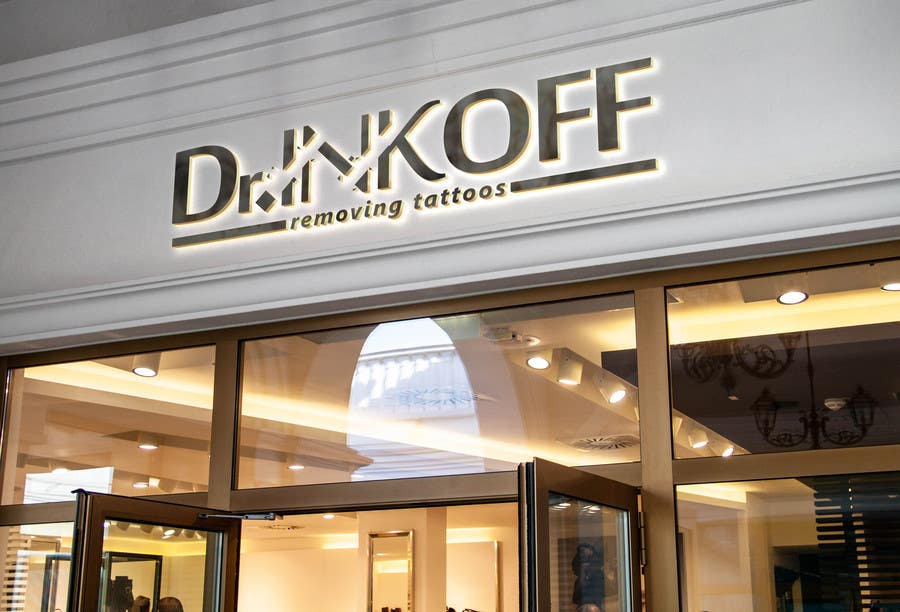
I wish you will like my proposition. Your treatments do use laser as maon powerful tool to rmove the tattoos, yet in my design I used an eraser . The DOT in "Dr." is rotated a little to create the illusion that it is an eraser having deleted some of the word INK. using a slogan under the logo will explain more the nature of your treatments. it is better than drawing a laser gun. using the logo in one color version will be weird then.
Proposition n°13 du concours                                                 Design a logo
Proposition n°13

Tableau de clarification publique

  • sinzcreation
    sinzcreation
    • il y a 8 ans

    I also do have an idea for the standalone icon that can represent you. , if you accord us more time for the contest I can submit that too. The main element here is the Dot of Dr. it plays a role in showing the nature of your activity.

    • il y a 8 ans
  • tclund
    Titulaire du concours
    • il y a 8 ans

    Thanks, I like your proposition a lot, it looks great, and it's very creative. But I'm afraid it is a bit too complicated to handle in a consistent way in practice i.e. the small pieces in the sign. I think we will go for something more simple because what we do should be perceived as uncomplicated.

    • il y a 8 ans
    1. sinzcreation
      sinzcreation
      • il y a 8 ans

      Thanks Sir, I can enhance it more and make it less complicated by deleting the fragments around the deleted spaces on the word INK

      • il y a 8 ans