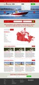
looking at the example websites you gave, all the sites portrayed the sport as a dull sport that isn't that exciting and fun. I wanted to take a bold step to portray than in your site. And make it a little bright. But i can definately reduce it you say so. And adjust the color scheme to your preference.
The page was becoming too long during the design process so i gave an example of how the other section will look like by creating only the fishing reports and blog posts ...the rest will look the same i.e gear section
il y a 10 ans
Titulaire du concours
il y a 10 ans
I like the idea however the banner takes up too much space. I'm also not too sure about that colour scheme as the red feels a little to bright. It's also missing the hottest gear section