Tableau de clarification publique

  • vishalds
    Titulaire du concours
    • il y a 10 ans

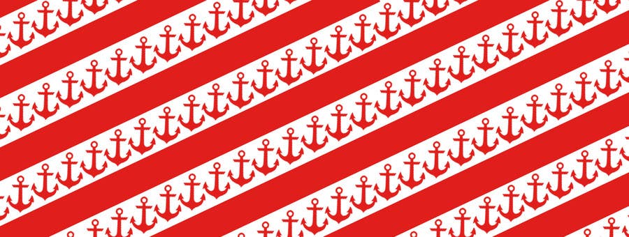
    Also, the Anchor symbol that is being used int his artwork, is different from the logo.Please use the same symbol from the original anchor logo. If you notice the width and shape of the anchor icon symbol is a bit thin and sleek, this is thicker, which makes it different from the logo altogether.

    • il y a 10 ans
  • vishalds
    Titulaire du concours
    • il y a 10 ans

    This one looks better, there was one instruction which you didnt understand... Let me rephrase it, I think im gonna award you the project, I just need to see the right and final entry to work with
    I want the anchor symbos to be smaller, at least 60% smaller, so they look more evenly spaced out. These look good but they look to crowded and cramped up.
    Also, as for the red stripes, I wanted you to put the Anchor logo and letters just as in the original design I uploaded in White. Remember the blue stripes had anchor written inside in white with the symbol, I want the same, but inside these red stripes.

    • il y a 10 ans