Tableau de clarification publique

  • richlandrecords
    Titulaire du concours
    • il y a 8 ans

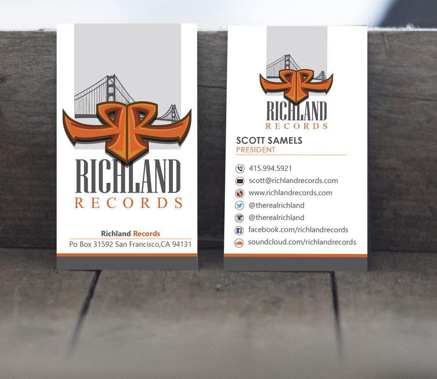
    wow this looks really clean. I would prefer if you don't use the exact same logo on the side with all my information on it. Maybe just use the logo except for the Richland Records lettering. On the front at the bottom instead of Richland Records, can you make it say Richland Records LLC

    • il y a 8 ans
    1. sixthsensebd
      sixthsensebd
      • il y a 8 ans

      thank you sir for your nice feedback.Please check updated the business card design at entry #129 , #130 , #131 , #132 .

      • il y a 8 ans
  • richlandrecords
    Titulaire du concours
    • il y a 8 ans

    this is a great design and also a top one at the moment

    • il y a 8 ans